PT: Trabalho acadêmico para o curso de Profissão: Designer Gráfico. A proposta do trabalho é criar uma marca de skincare.
EN: Academic work for the Graphic Design course. The project's goal is to create a skincare brand.
Briefing
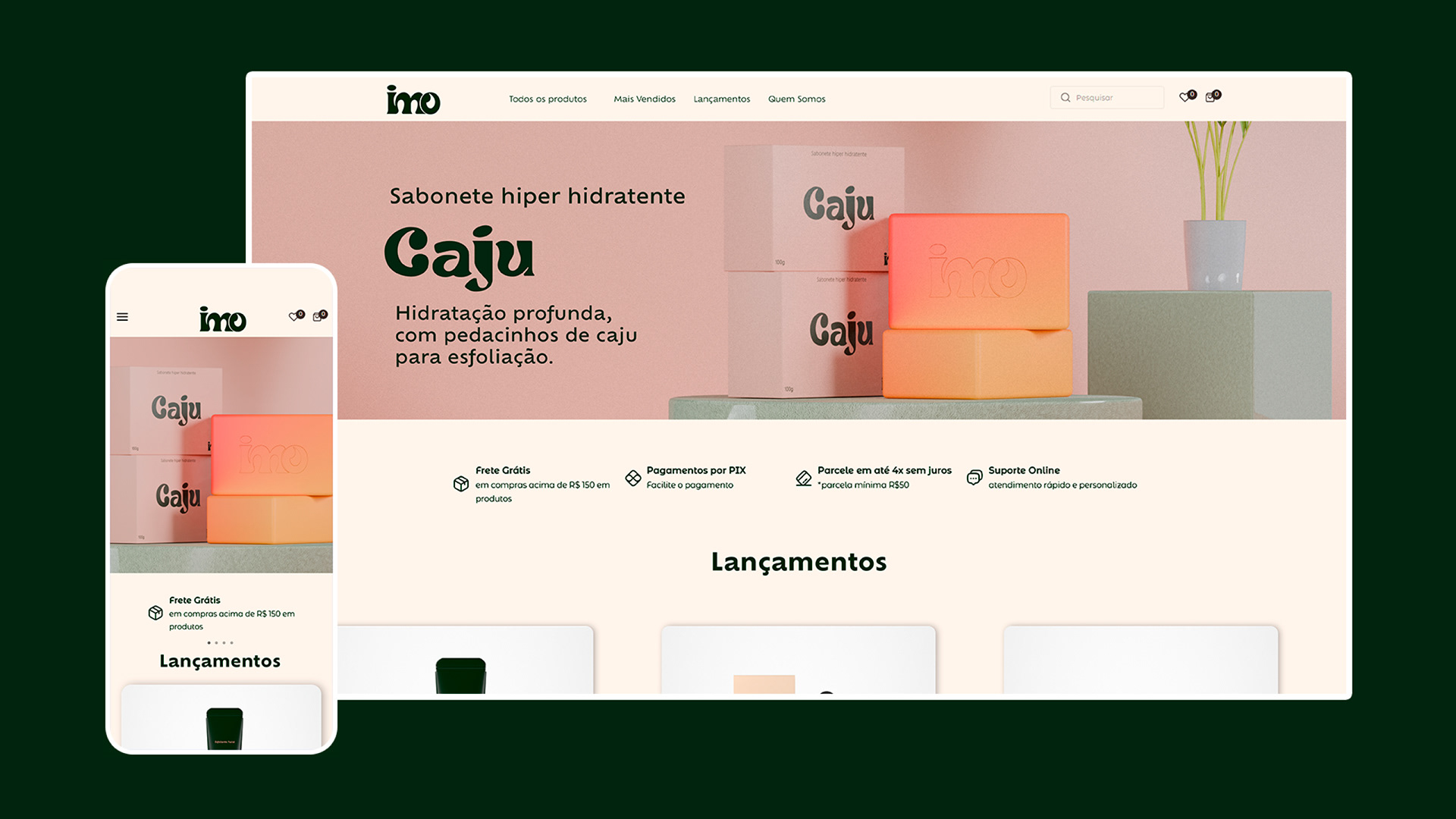
PT: Uma linha de produtos para a pele que com fórmulas naturais, orgânicos, plant based, não testado em animais e 100% brasileira. A fabricante se preocupa com a experiência do cliente, mesmo atuando em lojas físicas como farmácias e mercado. A linha de sabonetes em barra será o ponto inicial, onde, no futuro, haverá extensão de linhas para outros produtos.
A marca se conecta com o jeito espontâneo de ser do brasileiro, onde os donos, sugeriram a utilização de cores, grafismos que relevem essa caraterística, etc.
Como público temos pessoas de 20 a 40 anos que começaram a se interessar em skincare.
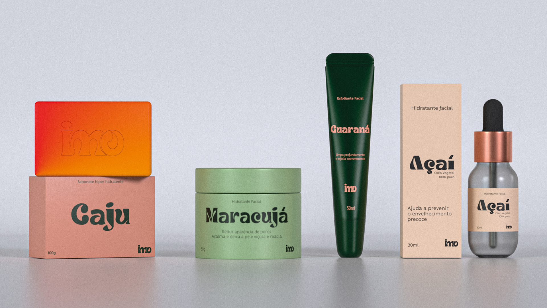
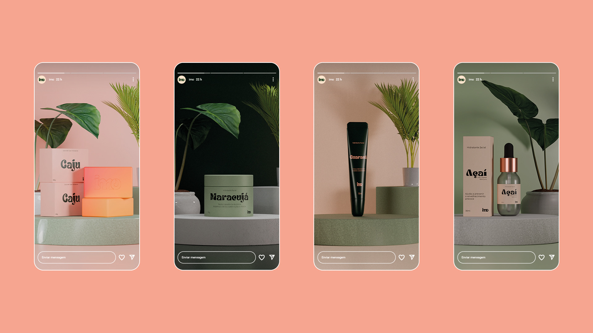
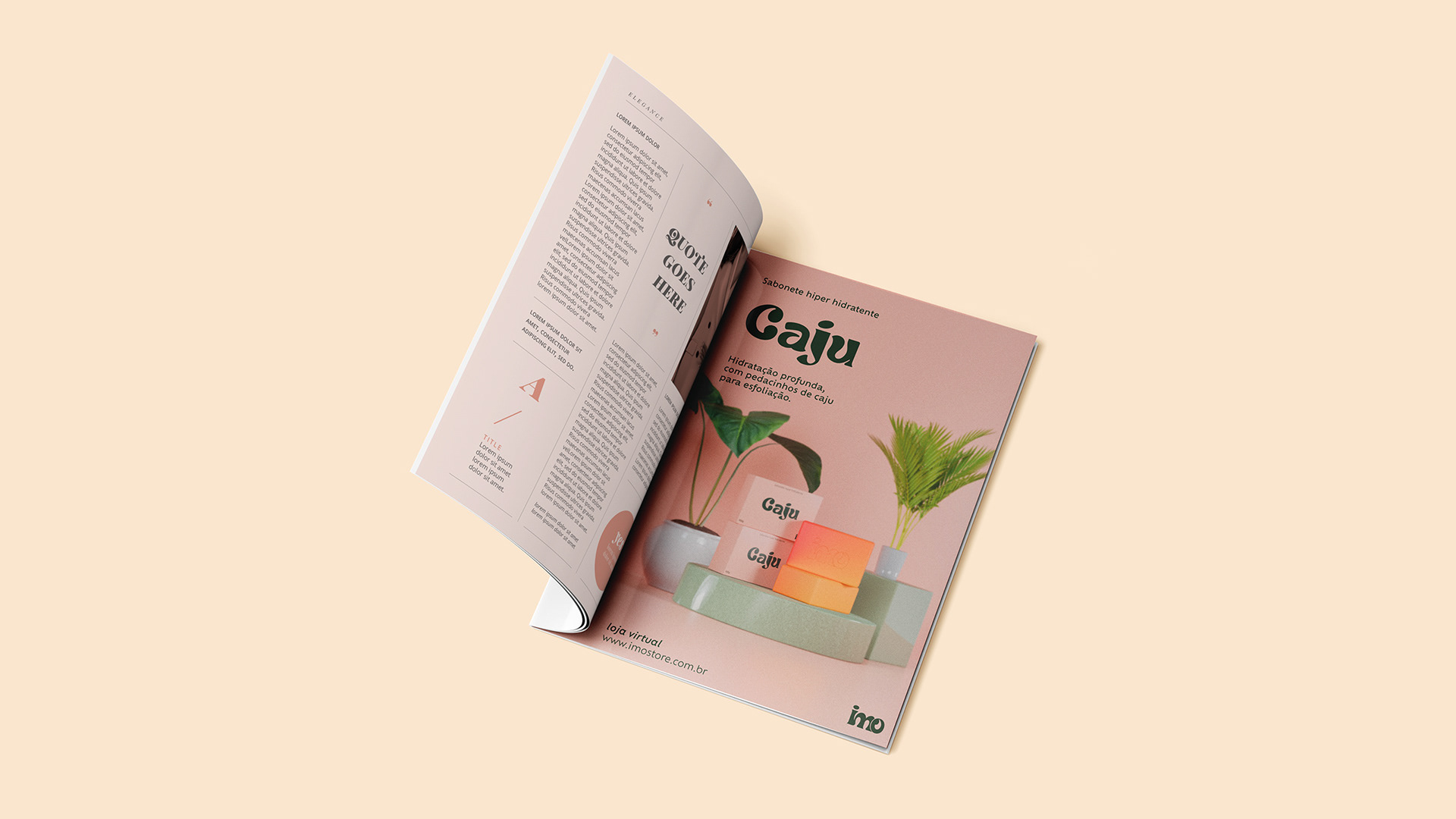
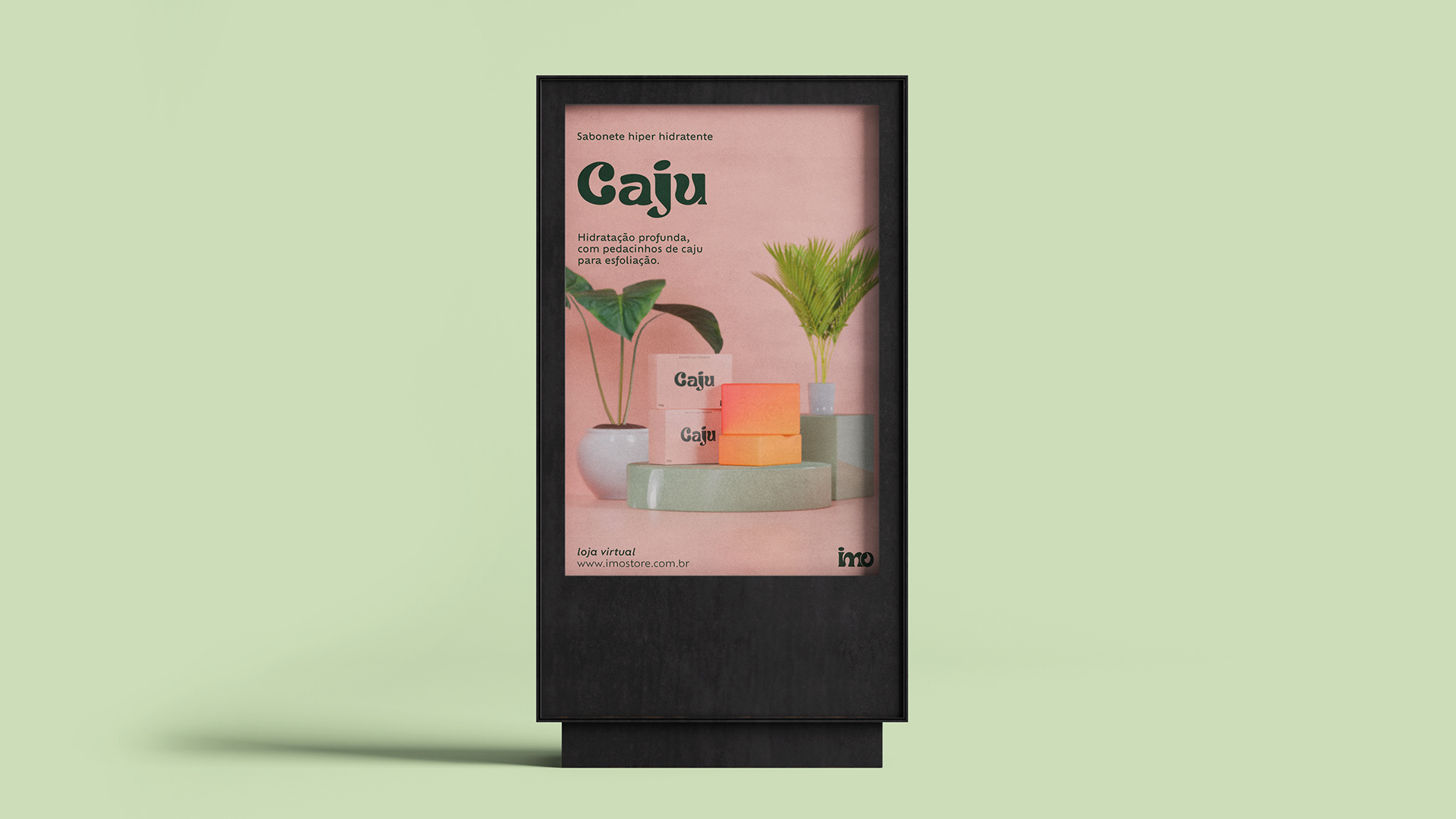
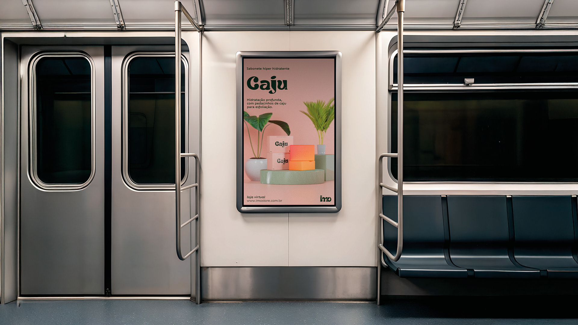
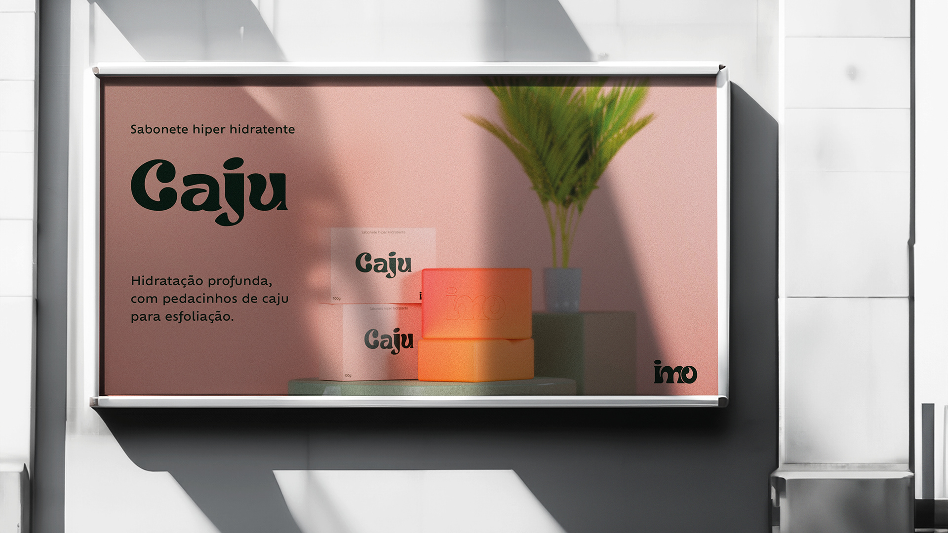
Vamos começar com um sabonete de caju hiper hidratante, ele vem com micro pedacinhos da castanha do caju para esfoliação da pele durante o banho e o formato da barra tem um corte rústico de uma pedra bruta.
EN: A line of skincare products with natural, organic, plant-based formulas, not tested on animals and 100% Brazilian. The manufacturer cares about the customer experience, even operating in physical stores such as pharmacies and supermarkets. The line of bar soaps will be the starting point, where, in the future, there will be an extension of lines to other products.
The brand connects with the spontaneous way of being of Brazilians, where the owners suggested the use of colors, graphics that highlight this characteristic, etc.
Our target audience is people aged 20 to 40 who have started to become interested in skincare.
Let's start with a super moisturizing cashew soap, it comes with micro pieces of cashew nut for exfoliating the skin during the bath and the shape of the bar has a rustic cut of a raw stone.
Naming
imo
ADJETIVO
1. formal
o mais baixo; inferior, ínfimo.
2. figurado
muito íntimo, muito profundo; interno, recôndito.
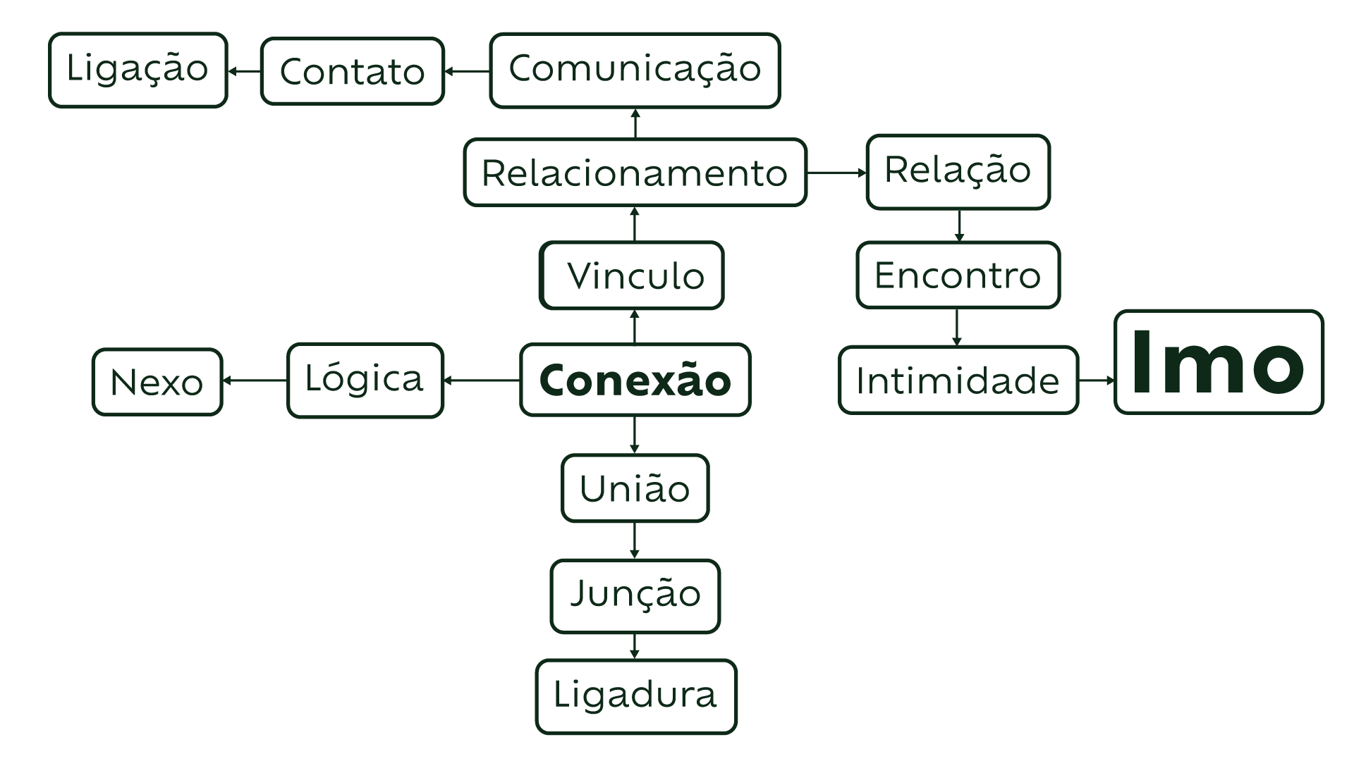
PT: O hábito de cuidar da pele todos os dias, traz a ideia de algo íntimo, algo profundo, um hábito profundamente pessoal. A ideia da marca é uma busca por se conectar com a natureza de forma intima, profunda que também seja delicada. A palavra “imo“ é uma palavra incomum e fácil de lembrar, tem conexão com a ideia de algo profundo, íntimo e remete a algo delicado, simples.
EN: "Imo" is a Portuguese word meaning intimate, that which is deepest, most internal; the core, the essence.
The habit of caring for one's skin every day evokes the idea of something intimate, something profound, a deeply personal habit. The brand's concept is a quest to connect with nature in an intimate, profound, yet delicate way. The word "imo" is an uncommon and easy-to-remember word, connected to the idea of something deep, intimate, and reminiscent of something delicate and simple.
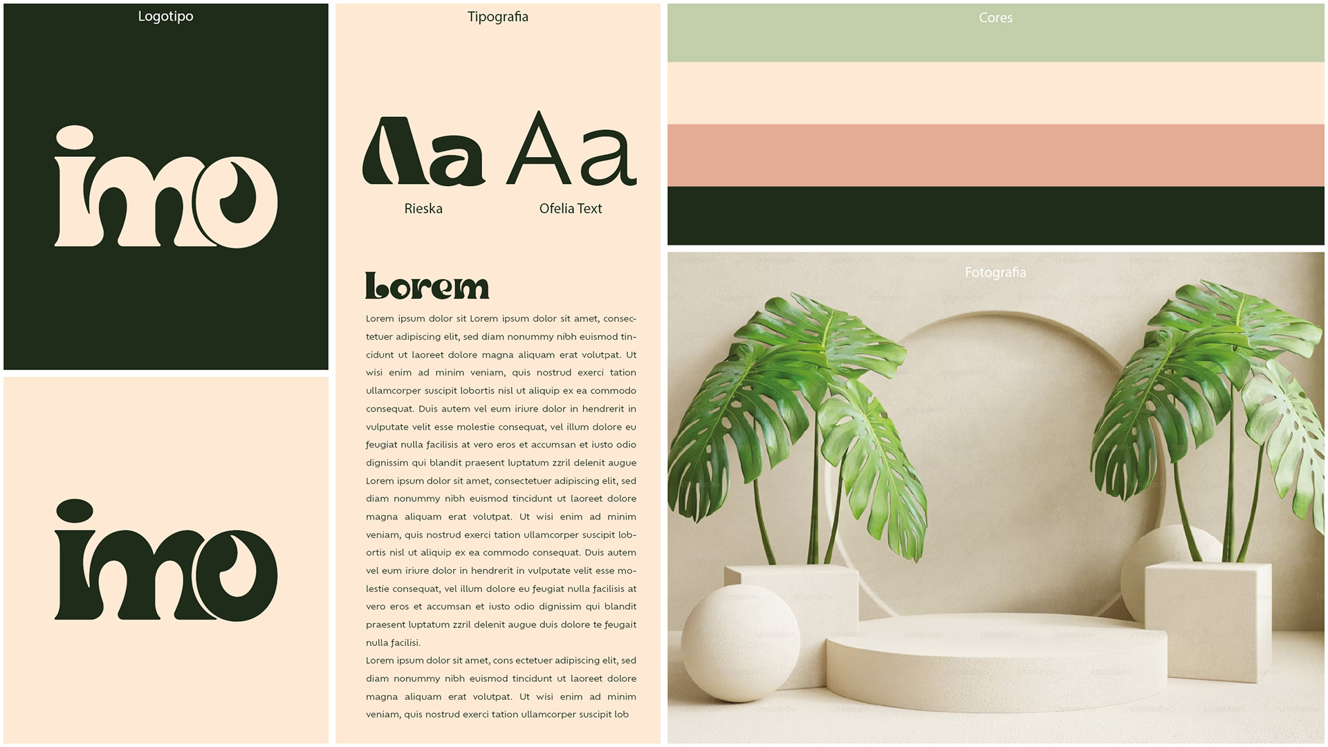
Escolha da Tipografia
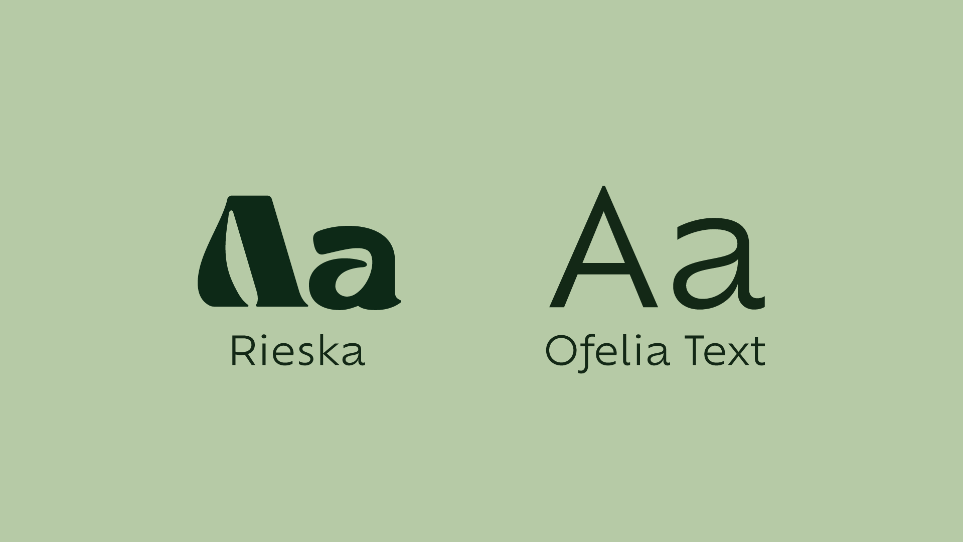
PT: Como principal elemento da marca, a tipografia precisa ter personalidade com desenho icônico, letras com bastante curvas que de certa forma lembrasse uma folha.
A fonte principal Rieska, é uma fonte que chama bastante atenção por conta do contraste forte entre as hastes, linhas bastantes curvas dando personalidade as letras.
Typography Choice
EN: As the main element of the brand, the typography needs to have personality with an iconic design, letters with many curves that somehow resemble a leaf.
The main font, Rieska, is a font that attracts a lot of attention due to the strong contrast between the strokes, with very curved lines giving personality to the letters.
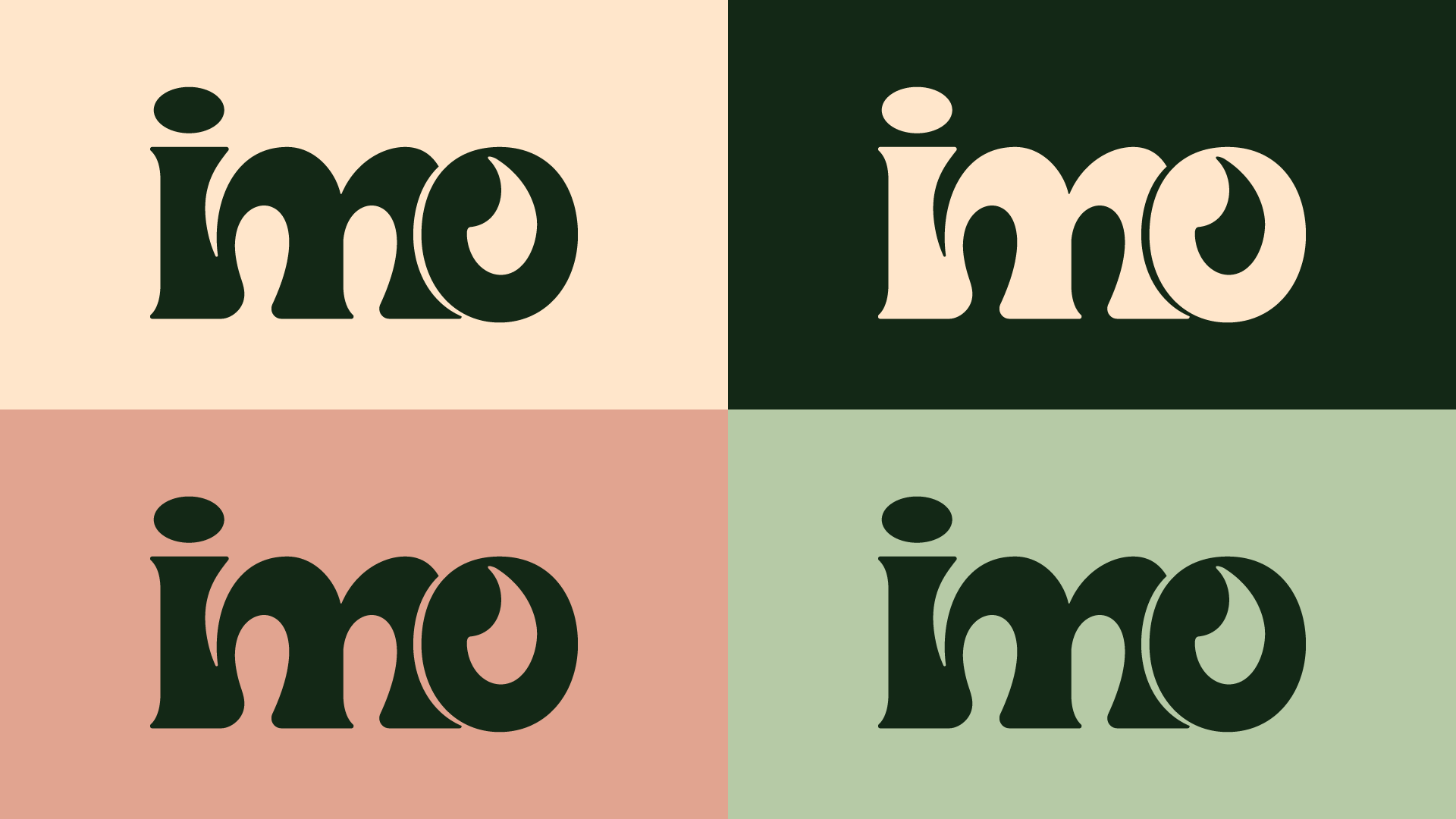
Construção do logotipo
PT: A primeira ideia seria escrever o logotipo somente com caixa alta, porém, não dá intepretação algo delicado, mas algo bruto.
Logo Design
EN: The initial idea was to write the logo entirely in uppercase letters, however, this doesn't convey a delicate or rough interpretation.

PT: Como segunda ideia seria usar escrever o logotipo somente com caixa baixa, desta forma remete a algo mais delicado.
EN: As a second idea, we could use only lowercase letters for the logo, which suggests something more delicate.

PT: Porém, a letra “o“ em caixa baixa, não parece combinar com as outras, por isso optei por utilizar a letra “o“ em caixa alta.
EN: However, the lowercase letter "o" doesn't seem to match the others, so I opted to use the uppercase letter "o".

PT: A letra “o“ em caixa alta ultrapassa a altura-x, causando muita estranheza. Como solução foi redimensionar a letra “o“ para a altura-x.
EN: The uppercase letter "o" exceeds the x-height, causing a very strange appearance. The solution was to resize the letter "o" to the x-height.

PT: Buscando simplificar mais o logotipo foi aproveitar o desenho da letra “m”, pegando a haste vertical para emular a letra “i“. Porém, para o ponto ficar mais harmônico com o desenho do “m“, foi redimensionado e alinhado no eixo horizontal para acompanhar melhor a haste vertical.
EN: In an effort to further simplify the logo, the design of the letter "m" was used, employing the vertical stem to emulate the letter "i". However, to make the dot more harmonious with the "m" design, it was resized and aligned on the horizontal axis to better match the vertical stem.

PT: Buscando estilizar ainda mais o logotipo foi pego a letra “o” sobre a letra “m“ para se fazer um corte estilizando a letra “m” criando um espaço vazio, podendo assim diminuir o tracking entre o “m” e “o“.
EN: In an effort to further stylize the logo, the letter "o" was placed over the letter "m" to create a stylized cut, resulting in an empty space and thus reducing the tracking between the "m" and "o".
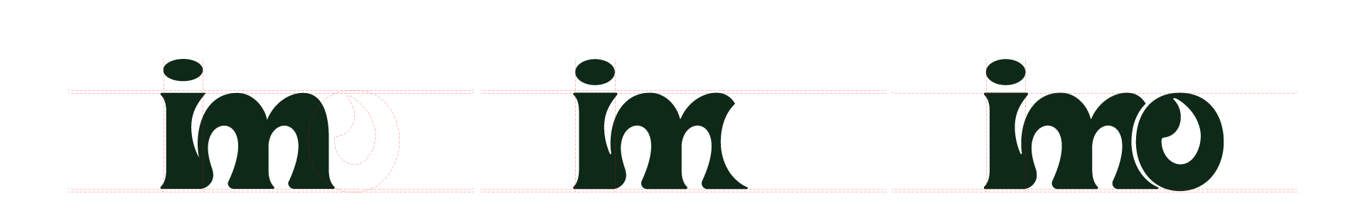
PT: O resultado é agradável, traçados orgânicos e com contrastes agradaáveis.
EN: The result is pleasing, with organic lines and pleasing contrasts.
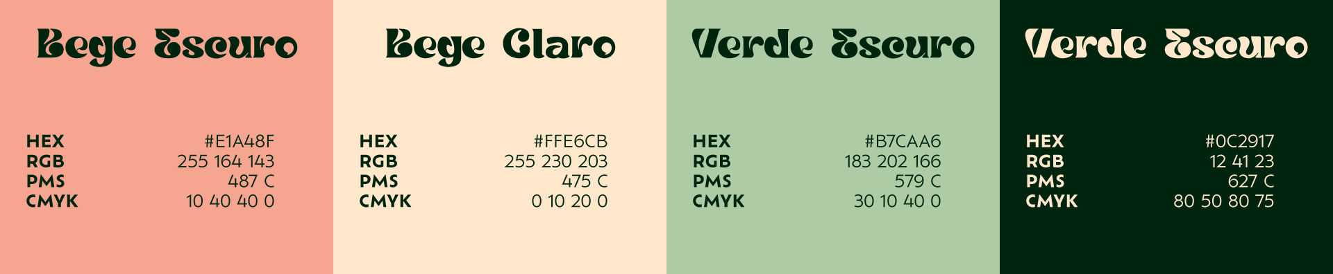
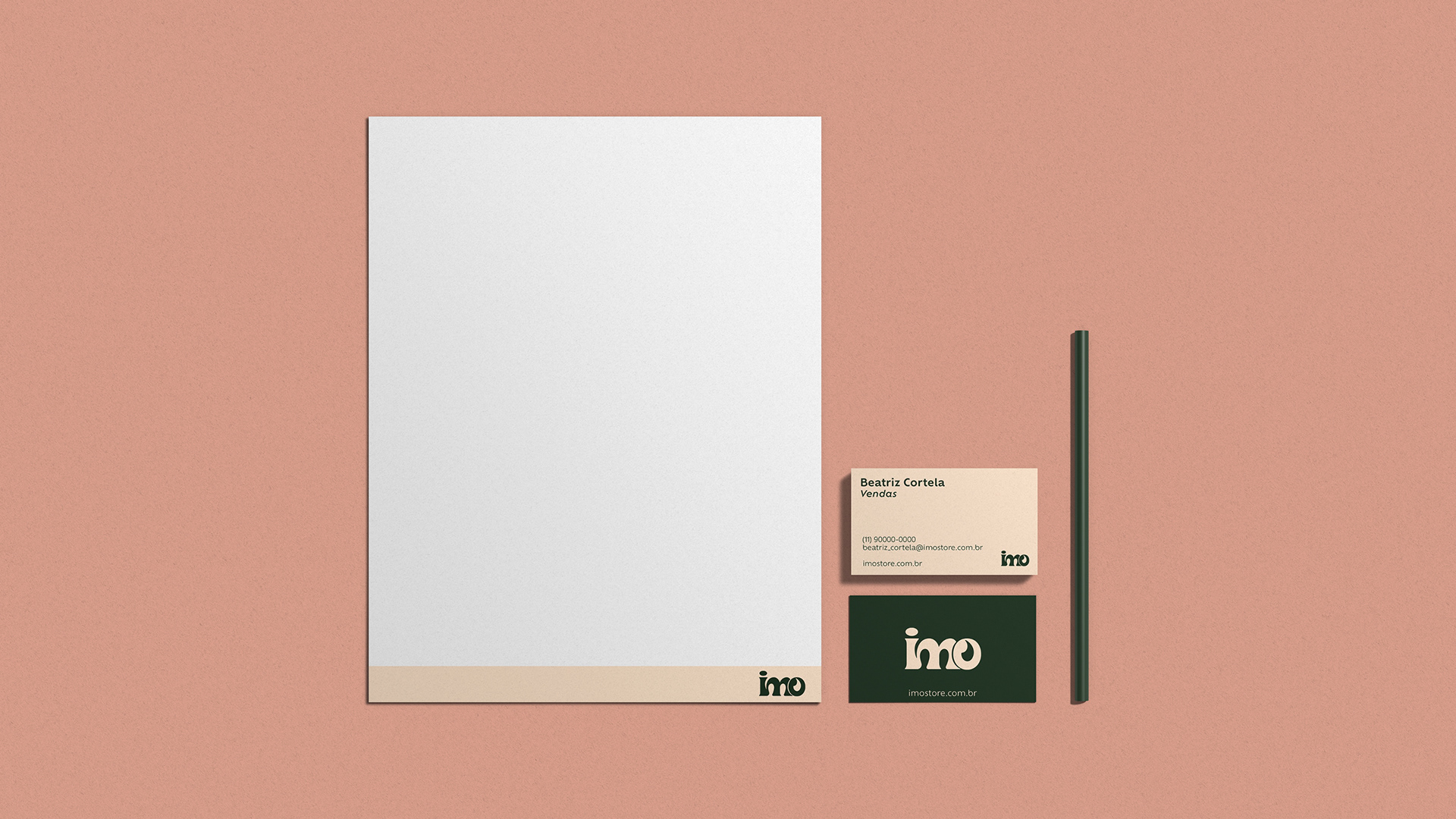
Escolha das cores
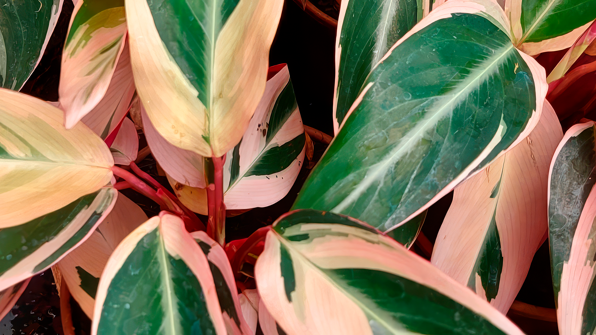
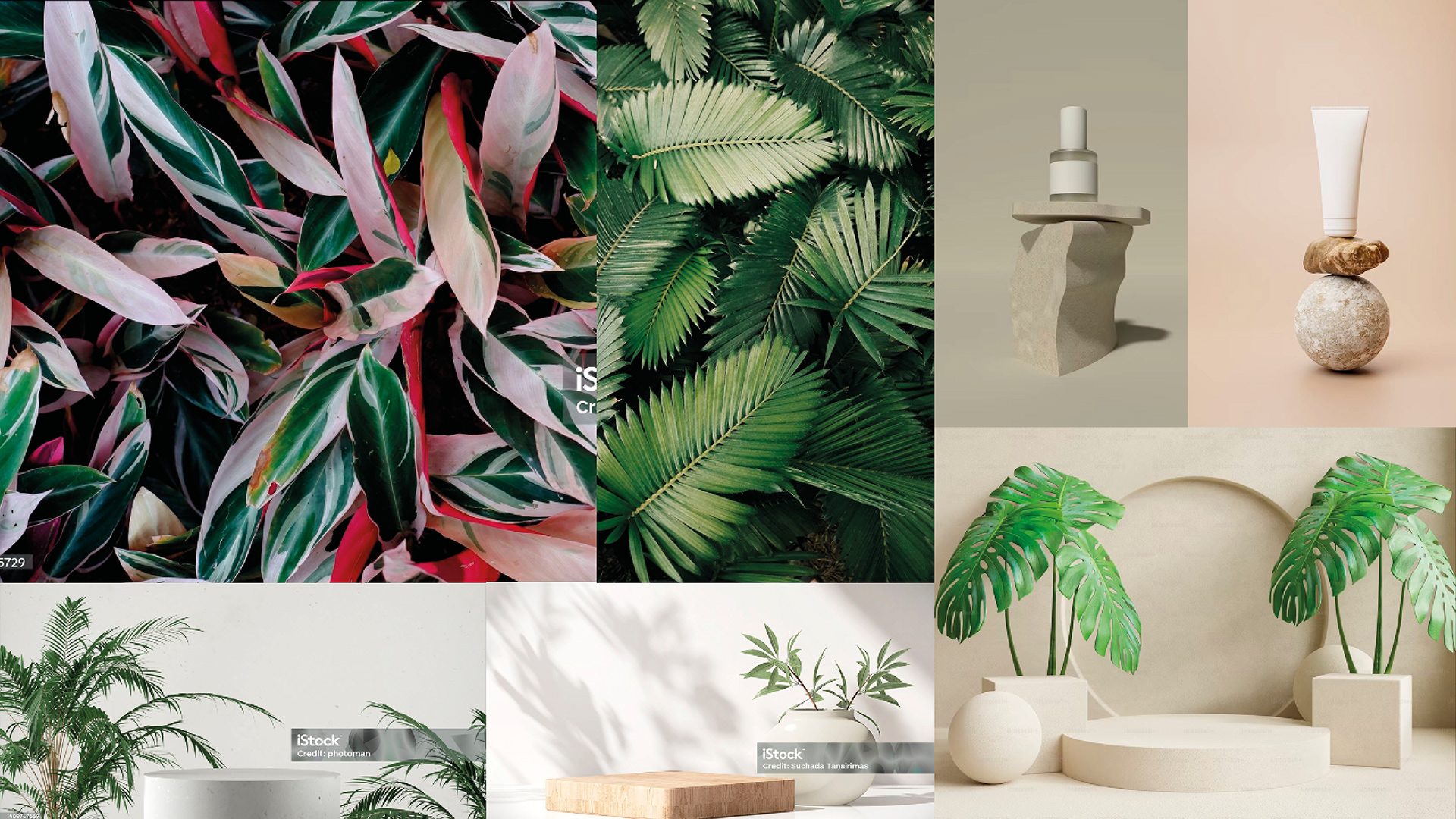
PT: A inspiração das cores vem uma planta tropical chamada Maranta Tricolor.
A maranta tricolor é nativa do Brasil e da América do Sul, crescendo naturalmente em florestas tropicais. Ela prospera em climas quentes e úmidos, sendo encontrada em várias regiões do Brasil, incluindo a Mata Atlântica, e em outros países sul-americanos, como Colômbia e Venezuela.
Foi escolhido 3 tons suaves com baixa saturação para fazer contrastes com de verde mais escuro.
Color Choice
EN: The inspiration for the colors comes from a tropical plant called Maranta Tricolor.
Maranta tricolor is native to Brazil and South America, growing naturally in tropical forests. It thrives in hot, humid climates and is found in various regions of Brazil, including the Atlantic Forest, and in other South American countries such as Colombia and Venezuela.
Three soft, low-saturation shades were chosen to create contrasts with the darker green.