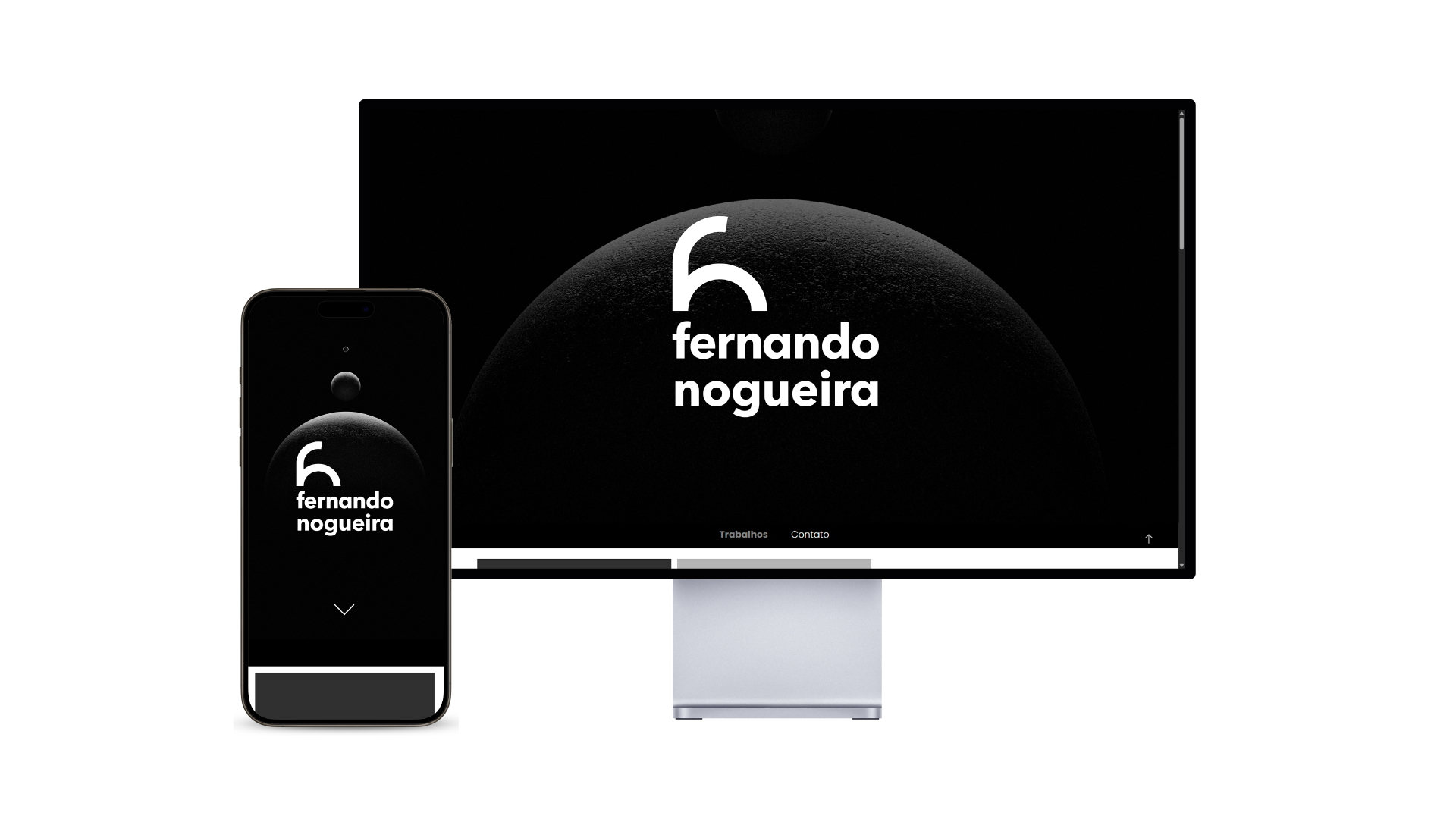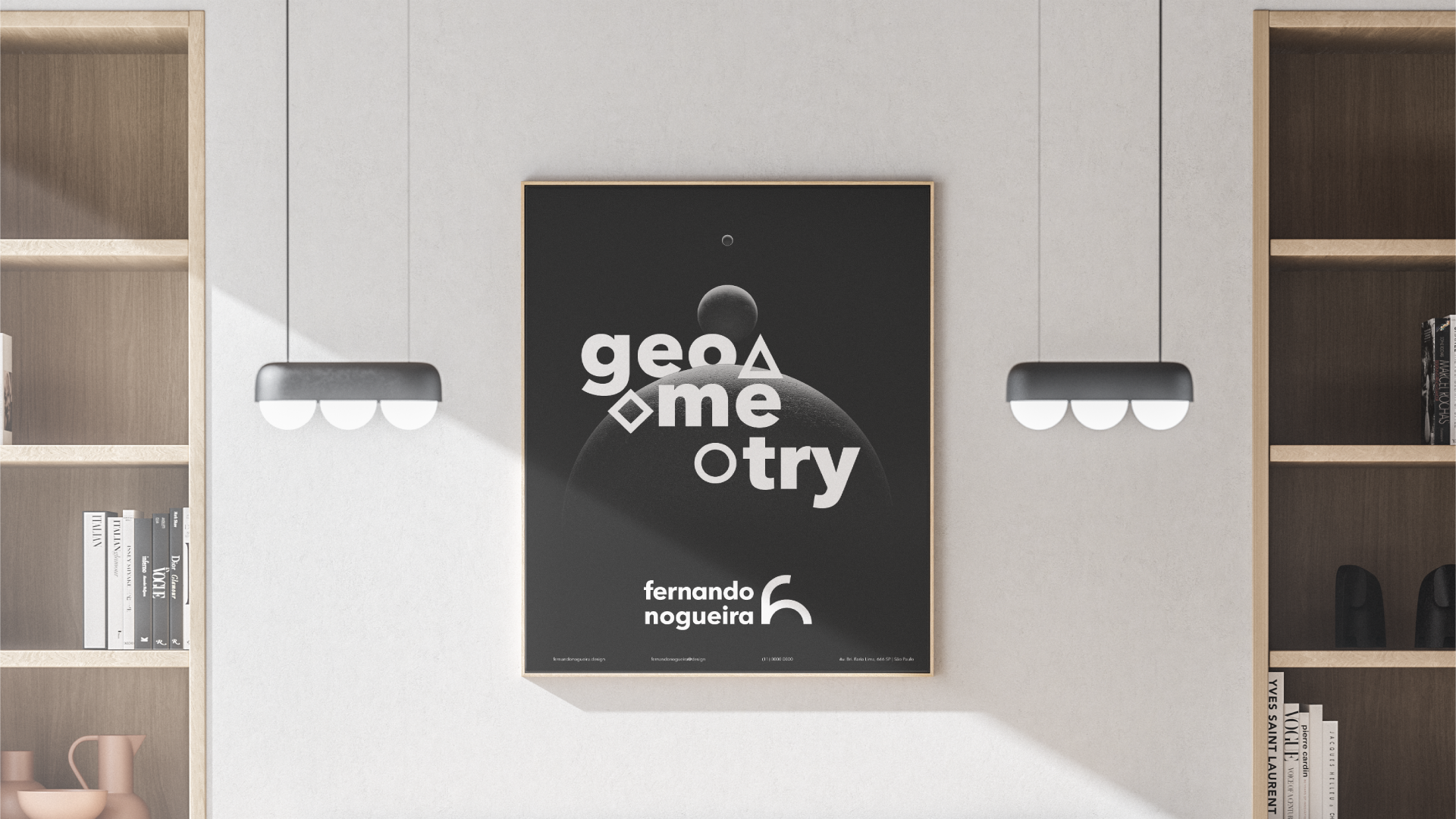
PT: Trabalho acadêmico para o curso de Profissão: Designer Gráfico. A proposta do trabalho é construir uma marca pessoal.
EN: Academic work for the Graphic Design course. The assignment is to create a personal brand.
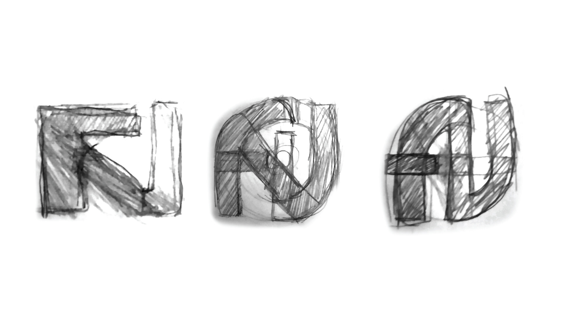
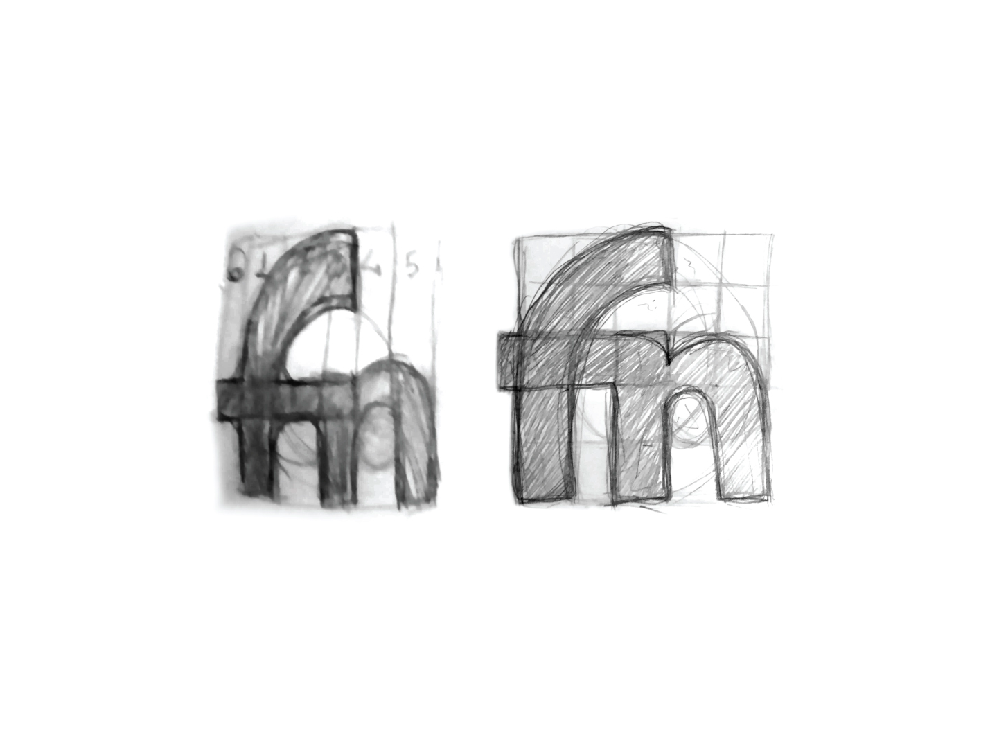
Rascunho
PT: Comecei rascunhando alguns monogramas com “F” e “N”, porém não cheguei a nenhum resultado agradável, pois quase todos lembravam um “F” com “J”. Mudei de estratégia e comecei a imaginar uma ligadura entre o “f” e o “n”.
Sketch
EN: I started by sketching some monograms with "F" and "N", but I didn't come up with any pleasing results, as almost all of them resembled an "F" with a "J". I changed my strategy and started imagining a ligature between the "f" and the "n".
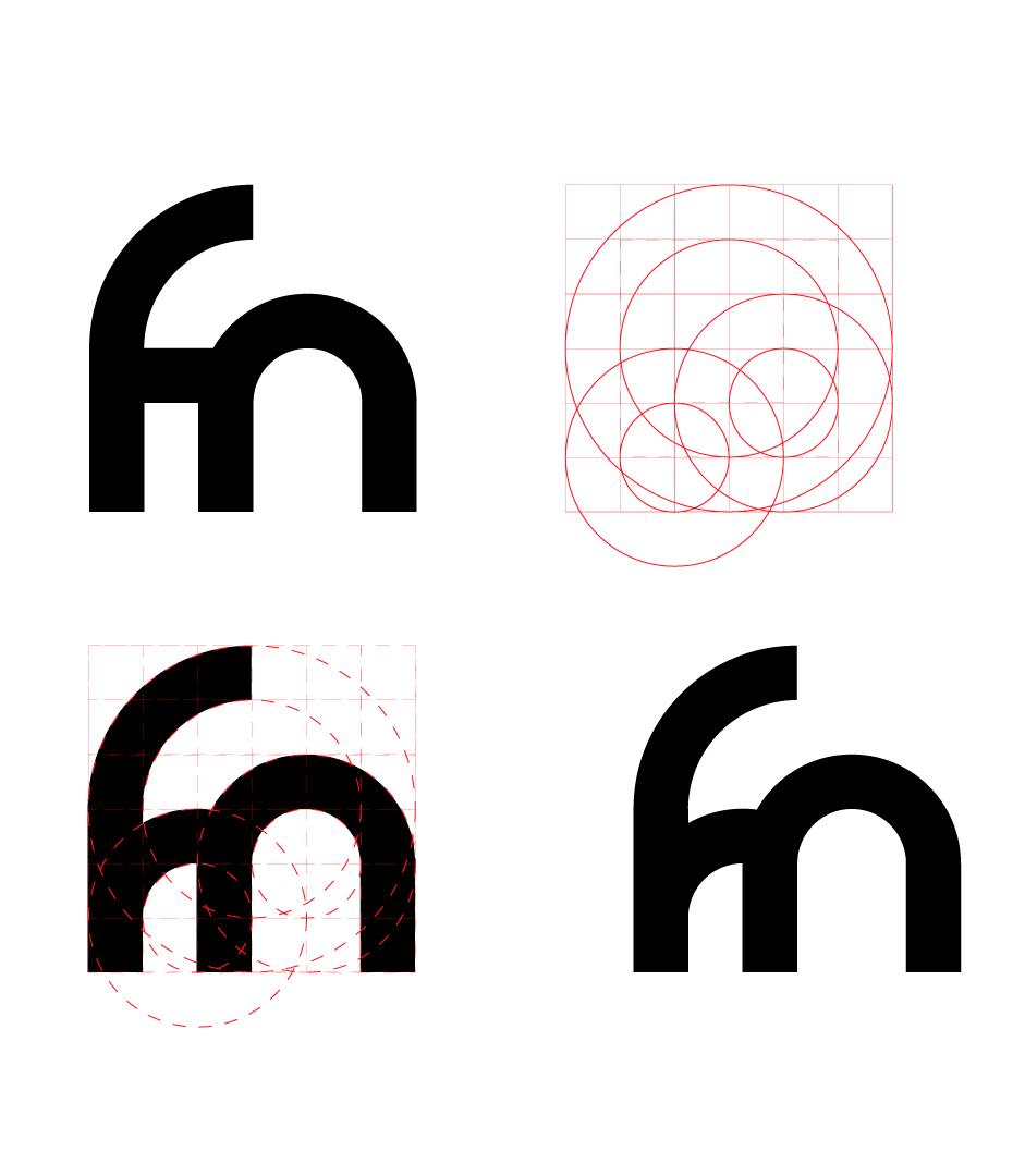
Buscando grid adequando
PT: Consegui chegar a um resultado agradável e, a partir dele, resolvi buscar um grid que fosse adequado à forma, ainda na fase de rascunho. Tentei rascunhar um grid modular com círculos que se encaixassem dentro dos módulos.
Looking for a suitable grid
EN: I managed to arrive at a pleasing result and, based on that, I decided to look for a grid that would be suitable for the shape, even in the drafting phase. I tried to sketch a modular grid with circles that would fit inside the modules.
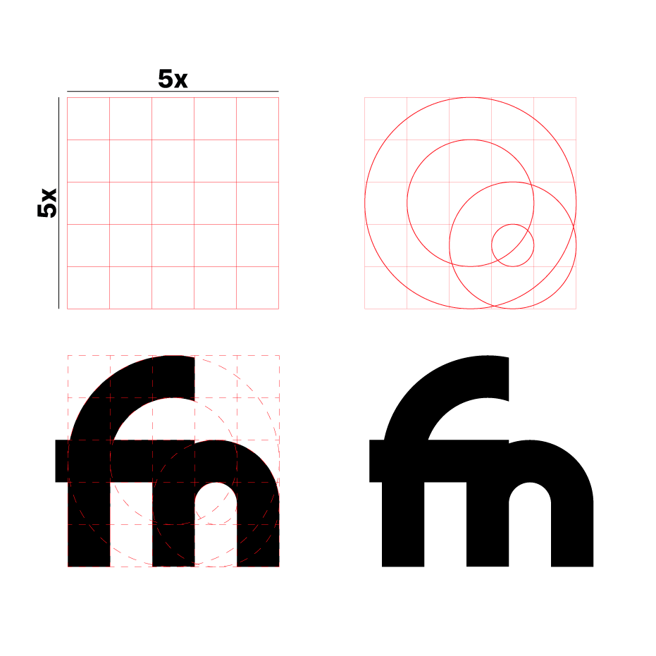
Desenho técnico
PT: Partindo do rascunho feito, criei um grid modular de 5×5, com círculos dentro do grid, com diferença de 1x entre um e outro.
Os dois círculos maiores foram utilizados para construir o terminal do “f” e os círculos menores, para a construção do ombro do “n”.
Technical drawing
EN: Starting from the initial sketch, I created a 5x5 modular grid with circles inside the grid, spaced 1x apart.
The two larger circles were used to construct the terminal of the "f" shape, and the smaller circles to construct the shoulder of the "n" shape.
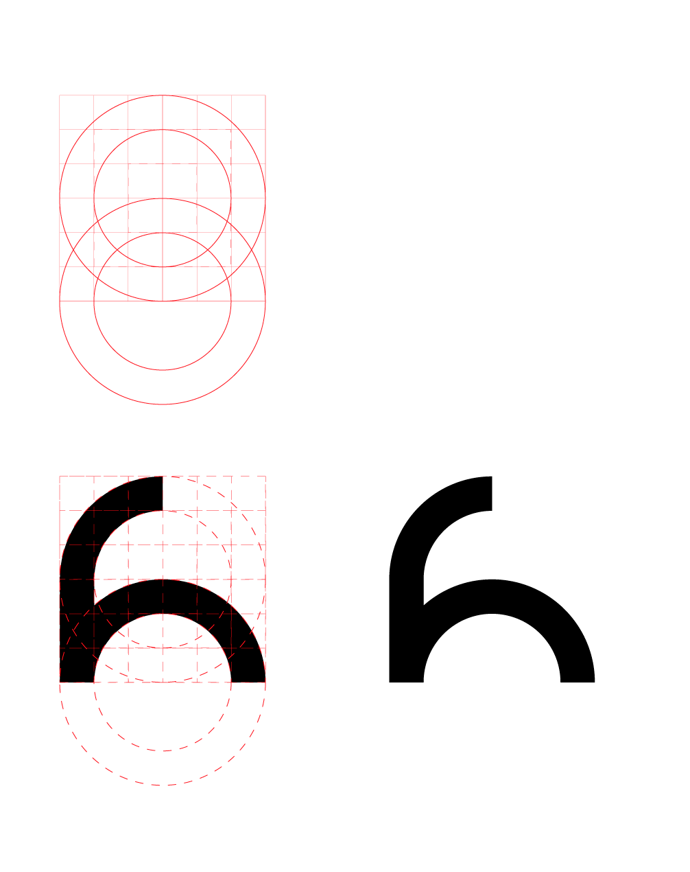
Buscando proporções
PT: O resultado que obtive seguindo somente o rascunho não me agradou.
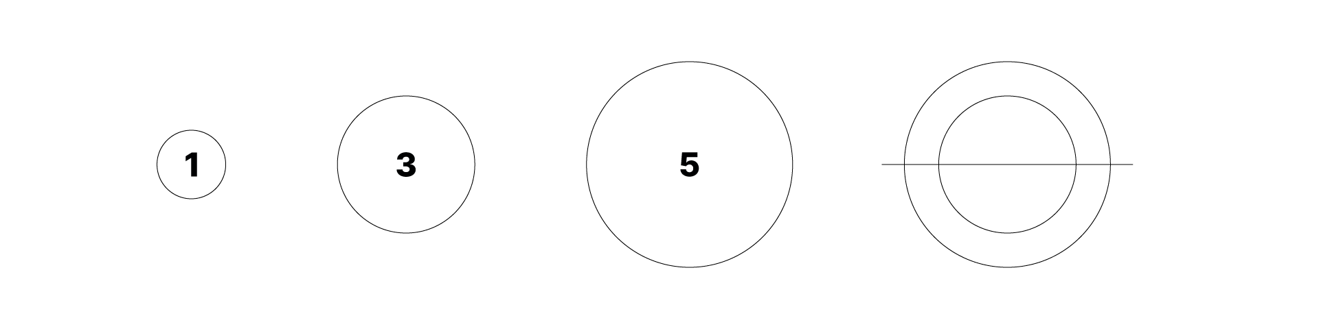
Então busquei trabalhar o grid com a golden ratio, tracei três círculos seguindo a sequência de Fibonacci. Peguei a diferença da medida entre o 3 e o 5, e utilizei essa medida para construir um grid modular que resultou em um grid 6×6.
Looking for proportions
EN: The result I obtained by only following the sketch did not please me.
So I tried working with the grid using the golden ratio, drawing three circles following the Fibonacci sequence. I took the difference in measurement between the 3 and the 5, and used that measurement to construct a modular grid that resulted in a 6×6 grid.
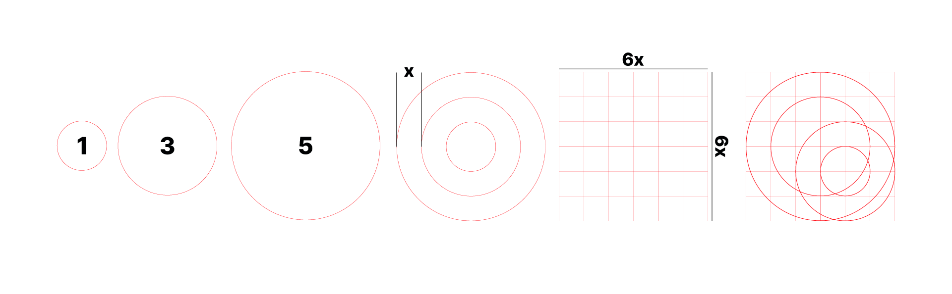
PT: Os círculos 3 e 5 utilizei para desenhar o terminal do “f”; dessa vez preferi manter a barra do “f” completamente dentro do grid. Já os círculos 1 e 3 utilizei para desenhar o ombro do “n”.
EN: I used circles 3 and 5 to draw the terminal of the "f"; this time I preferred to keep the "f" bar completely inside the grid. I used circles 1 and 3 to draw the shoulder of the "n".
Novas formas
PT: Utilizando a golden ratio, a forma do monograma ficou melhor em comparação ao resultado anterior, mas ainda sinto que há algo estranho na forma; a barra do “f” ainda me incomoda muito, tenho a impressão de que ela não faz parte da forma, criando um contraste ruim com os outros traços.
Então procurei resolver somente esse ponto específico, buscando colocar um traço mais fluido. Peguei os círculos 1 e 3 para formar a barra do “f”.
Como resultado, ficou mais agradável, agora existe uma harmonia entre os traços.
New ways
EN: Using the golden ratio, the monogram shape looks better compared to the previous result, but I still feel there's something strange about the shape; the bar on the "f" still bothers me a lot, I have the impression that it doesn't belong in the shape, creating a bad contrast with the other strokes.
So I tried to resolve only that specific point, aiming for a more fluid line. I used circles 1 and 3 to form the bar of the "f".
As a result, it became more pleasing; now there is harmony between the lines.
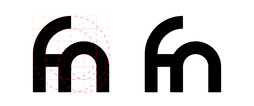
Abstração
PT: Apesar de o resultado anterior ter ficado agradável, ainda sinto certo incômodo em relação à forma. Então busquei simplificá-la, para deixar bastante abstrata a ideia de um “f” e um “n”. Utilizei as mesmas fórmulas que vinha utilizando para construir uma nova forma, só que desta vez mais abstrata.
Peguei os círculos 3 e 5 para desenhar novamente o terminal do “f”, porém desta vez utilizei os círculos 3 e 5 também para desenhar o ombro do “n” e a barra do “f” no mesmo traçado.
Desta vez o resultado me agradou muito; sinto que agora estou no caminho certo, mas ainda faltam alguns ajustes para deixá-lo ainda melhor.
Abstraction
EN: Although the previous result was pleasing, I still feel some discomfort regarding the shape. So I sought to simplify it, to make the idea of an "f" and an "n" quite abstract. I used the same formulas I had been using to construct a new shape, but this time more abstract.
I took circles 3 and 5 to redraw the terminal of the "f", but this time I also used circles 3 and 5 to draw the shoulder of the "n" and the bar of the "f" in the same stroke.
This time the result pleased me greatly; I feel I'm now on the right track, but some adjustments are still needed to make it even better.
Simplificação do grid
PT: Para melhorar a forma, busquei simplificar o grid: abandonei o grid modular e mantive apenas os círculos em sequência de Fibonacci. Peguei os círculos 3 e 5 e os dividi em duas partes, com um corte de 90º na horizontal.
Grid simplification
EN: To improve the shape, I sought to simplify the grid: I abandoned the modular grid and kept only the circles in Fibonacci sequence. I took circles 3 and 5 and divided them into two parts, with a 90º horizontal cut.
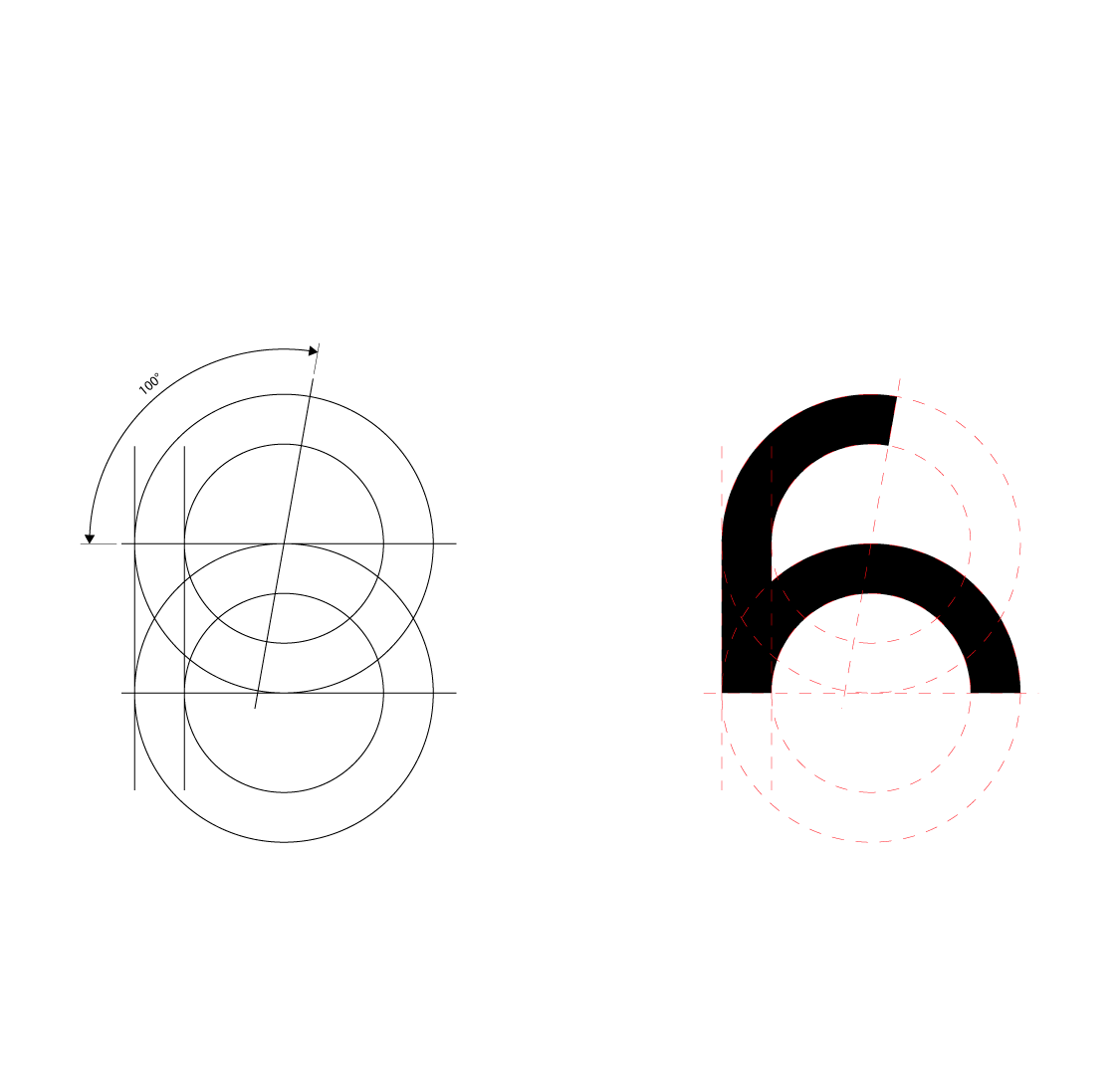
Construção do grid
PT: Peguei essa construção simplificada e dupliquei os mesmos círculos, cruzando os centros e os diâmetros dos círculos maiores. Rotacionei o corte do círculo superior em 100º e tracei uma linha vertical nas extremidades do lado esquerdo, ligando os círculos 5 com 5, e outra linha ligando os círculos 3 e 3.
Essa nova construção me agradou muito mais, principalmente pela terminação do “f”, que ficou muito melhor por conta do giro de 100º, gerando mais harmonia em todo o traçado do desenho.
Grid construction
EN: I took this simplified construction and duplicated the same circles, crossing the centers and diameters of the larger circles. I rotated the cut of the upper circle by 100º and drew a vertical line at the ends on the left side, connecting circles 5 with 5, and another line connecting circles 3 and 3.
I liked this new construction much more, mainly because of the "f" shape, which looks much better due to the 100º rotation, creating more harmony in the entire drawing.
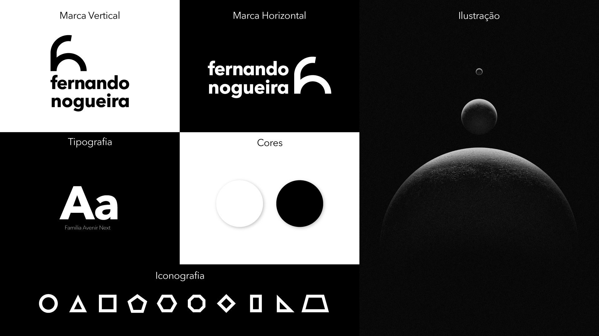
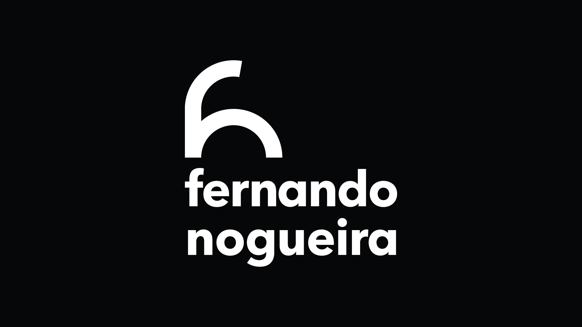
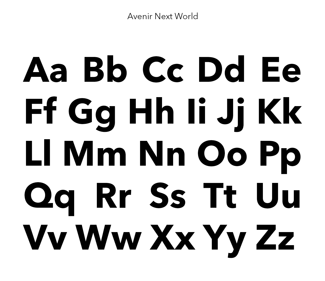
Escolha da fonte
PT: Para compor a marca, busquei fontes geométricas que lembrassem o traçado do monograma. Na pesquisa, o melhor resultado que consegui foi a Avenir Next, com peso em Bold. Para reforçar a combinação entre o monograma e o logotipo, coloquei todas as letras em caixa baixa. Para melhorar o contraste entre o monograma e o logotipo, utilizei a espessura do traço do monograma como valor X, assim as hastes do logotipo ficaram com espessura de X/2.
Font choice
EN: To create the brand, I looked for geometric fonts that resembled the monogram's outline. In my research, the best result I found was Avenir Next, with the weight Bold. To reinforce the combination between the monogram and the logo, I made all the letters lowercase. To improve the contrast between the monogram and the logo, I used the monogram's stroke thickness as the X value, so the logo's stems ended up with a thickness of X/2.
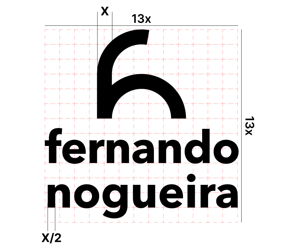
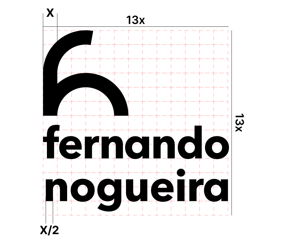
Grid modular
PT: Para a composição do brand, utilizei um grid modular, usando o mesmo valor de X para a medida do módulo. Para definir a quantidade de colunas e linhas do grid, busquei a sequência de Fibonacci, com a intenção de relacionar à construção do monograma. Cheguei a um grid de 13×13, onde o logotipo tem um bom espaçamento entre letras.
Modular grid
EN: For the brand composition, I used a modular grid, using the same X value for the module measurement. To define the number of columns and rows in the grid, I looked at the Fibonacci sequence, intending to relate it to the construction of the monogram. I arrived at a 13×13 grid, where the logo has good letter spacing.
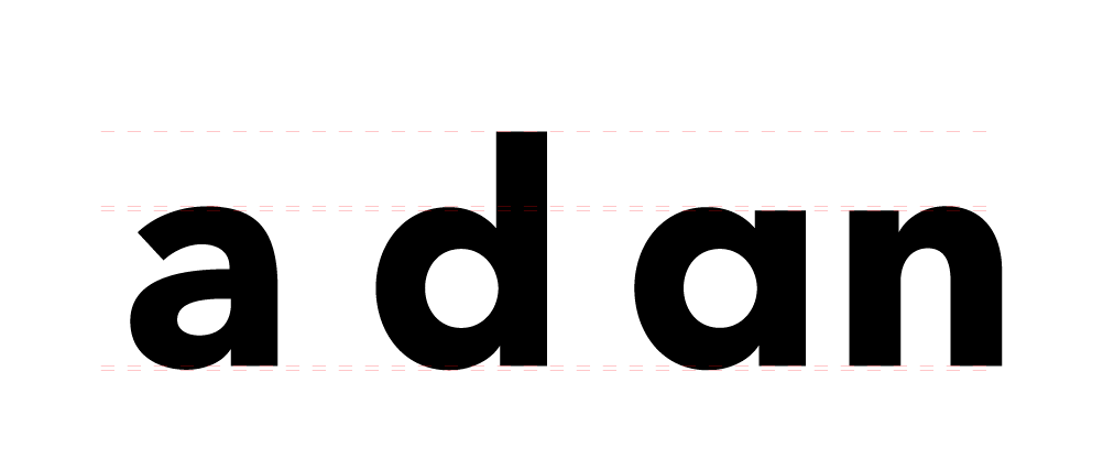
Adaptação da fonte
PT: Precisei fazer um ajuste no logotipo, pois a letra “a” com bojo ainda me causava estranhamento na composição da marca. Então resolvi usar uma alternativa, mas a fonte Avenir não possui um “a” alternativo.
Assim, peguei a letra “d” e a adaptei, descendo a haste da linha ascendente até a altura-x, transformando a letra “d” em uma letra “a”.
Font adaptation
EN: I needed to make an adjustment to the logo because the bulging "a" still looked strange to me in the brand's composition. So I decided to use an alternative, but the Avenir font doesn't have an alternative "a".
Therefore, I took the letter "d" and adapted it, lowering the stem of the ascent line to the x-height, transforming the letter "d" into a letter "a".
Últimos ajustes
PT: O resultado da adaptação da letra “a” dentro do logotipo me agradou muito. Esse desenho da letra “a” combina melhor com a construção do monograma e também melhorou o espaçamento entre as letras, principalmente dentro do grid.
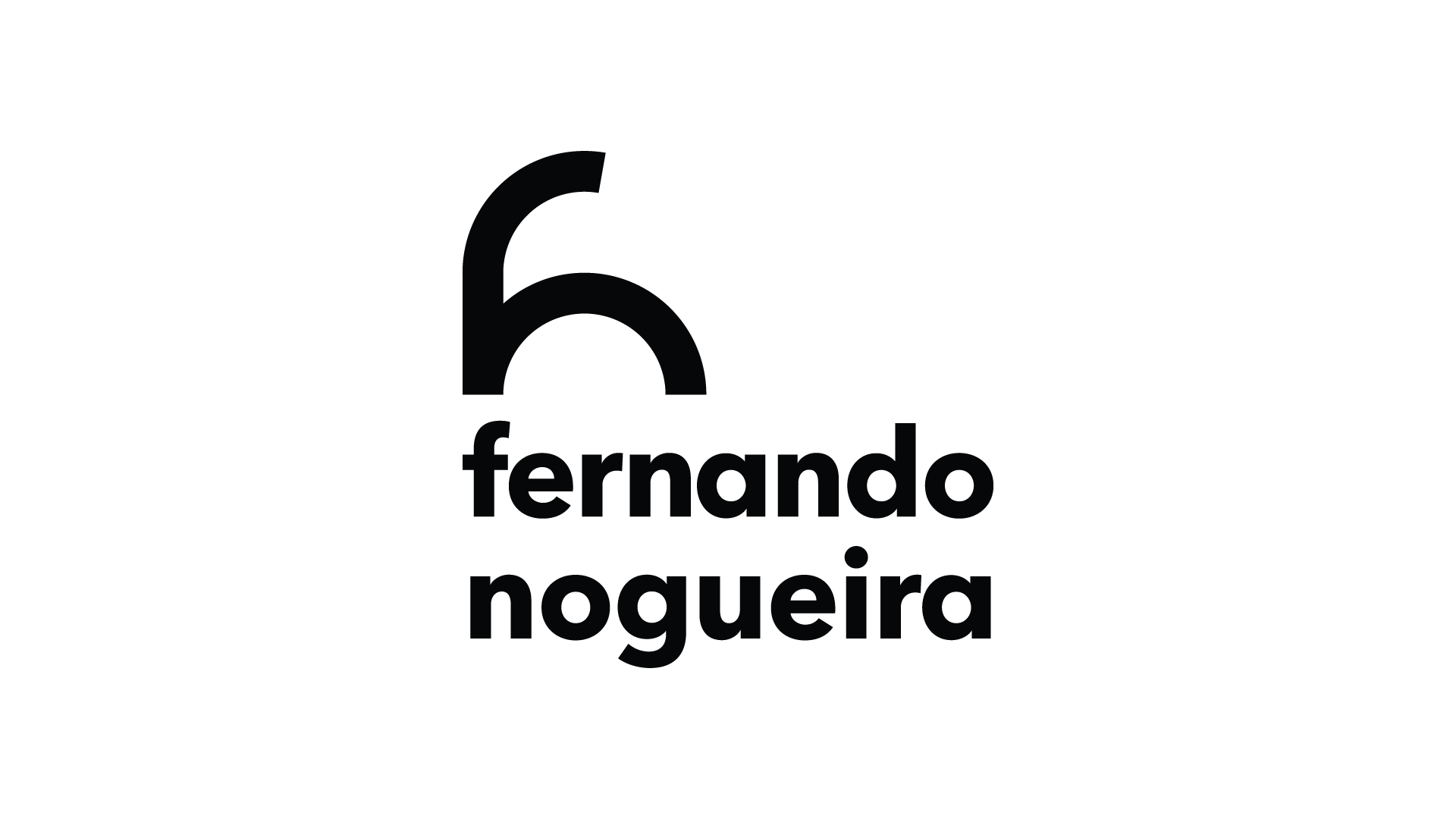
Optei por alinhar o monograma à esquerda, por ser mais agradável, deixando que o espaço vazio equilibre a composição da marca.
Final adjustments
EN: I was very pleased with the result of adapting the letter "a" within the logo. This design of the letter "a" combines better with the construction of the monogram and also improved the spacing between the letters, especially within the grid.
I chose to align the monogram to the left, as it is more pleasing, allowing the empty space to balance the brand's composition.
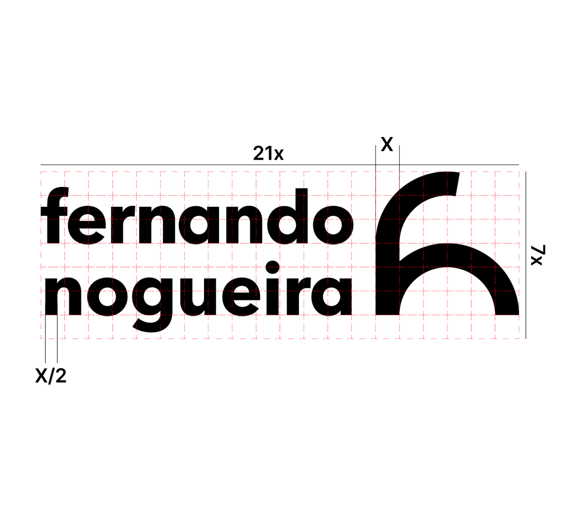
Versão compacta
PT: Para deixar a marca um pouco mais dinâmica, busquei uma versão mais compacta. Utilizando a mesma lógica da sequência de Fibonacci, cheguei a uma quantidade de colunas de 21 e altura proporcional ao desenho, resultando em um grid de 21×7.
Na versão compacta, optei por posicionar o monograma alinhado ao lado direito do grid, pois dessa forma a marca preenche a maior parte dos módulos sem muito espaço vazio, ficando assim mais agradável e equilibrada a composição.
Compact version
EN: To make the logo a bit more dynamic, I sought a more compact version. Using the same logic as the Fibonacci sequence, I arrived at a number of columns of 21 and a height proportional to the design, resulting in a 21×7 grid.
In the compact version, I chose to position the monogram aligned to the right side of the grid, because this way the logo fills most of the modules without much empty space, thus making the composition more pleasing and balanced.