PT: Trabalho acadêmico para o curso de Profissão: Designer Gráfico. A proposta do trabalho é definir parâmetros para o rebranding de marca conhecida.
EN: Academic work for the Graphic Design course. The purpose of the work is to define parameters for the rebranding of a well-known brand.
Marca escolhida
PT: A marca escolhida foi a Growth Supplements, uma marca de suplementação alimentar focada no público esportivo que busca uma alimentação saudável.
O que me incômoda na marca da Growth é o mal uso das cores, a marca precisa necessariamente estar em um fundo escuro. O vermelho e o azul brigam por atenção o tempo todo. A paleta de cores não remete ao uma atividade esportiva, não remete ao público-alvo, muito menos ao então o contexto da marca de alimentação esportiva.
Chosen Brand
EN: The chosen brand was Growth Supplements, a nutritional supplement brand geared towards athletes seeking a healthy diet.
What bothers me about the Growth brand is the inappropriate use of color; the logo necessarily needs to be on a dark background. Red and blue constantly compete for attention. The color palette doesn't evoke a sporting activity, it doesn't evoke the target audience, much less the context of a sports nutrition brand.

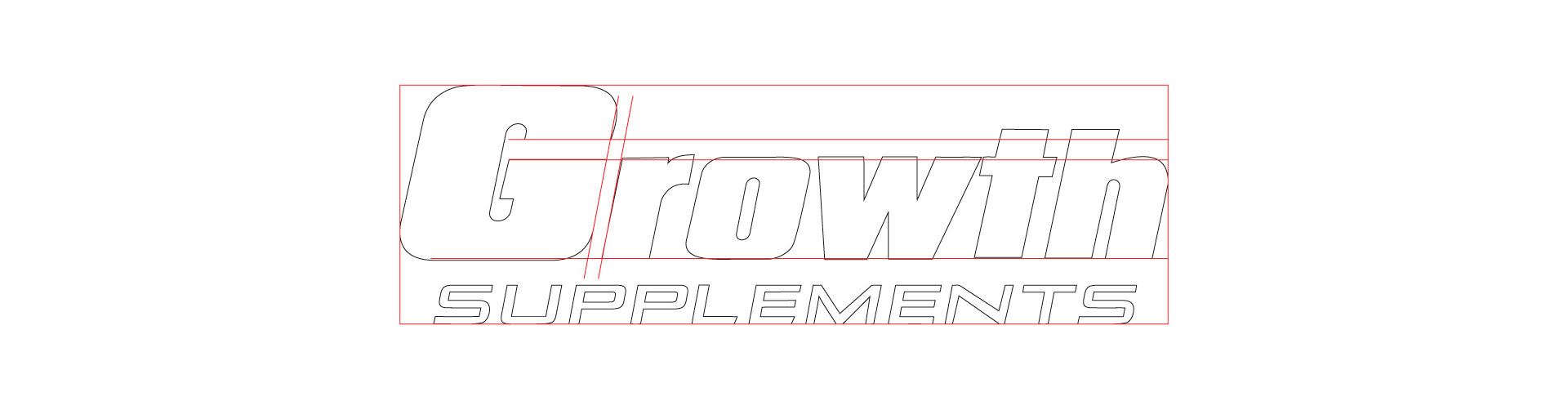
Erros no desenho técnico
PT: Quando passamos a marca para uma versão monocromática onde a forma do desenho tem mais destaque, se perde o destaque a letra “G” da versão principal da marca. Como o “G” é maior que o restante da palavra ‘’growth’’ de forma proposital para ganhar destaque ele acaba desequilibrando muito o desenho para o lado esquerdo e deixando muito espaço vazio desnecessário na parte superior central e direito.
A tipografia do logotipo é infeliz, por exemplo, o espaçamento entre o “w” e o “t’’ é muito curta o que acaba deixando o espaçamento do ‘’h’’ muito grande. A tagline ‘’SUPPLEMENTS” está deslocada da marca, algo que precisava por conta da função, mas não foi devidamente elaborada.
Errors in technical drawings
EN: When we switch the logo to a monochromatic version where the design's shape is more prominent, the "G" from the main version of the logo loses its emphasis. Because the "G" is intentionally larger than the rest of the word "growth" to gain prominence, it ends up unbalancing the design to the left and leaving a lot of unnecessary empty space in the upper center and right.
The logo's typography is unfortunate; for example, the spacing between the "w" and the "t" is too short, which makes the spacing of the "h" too large. The tagline "SUPPLEMENTS" is misplaced within the logo, something that was necessary for its function but wasn't properly executed.
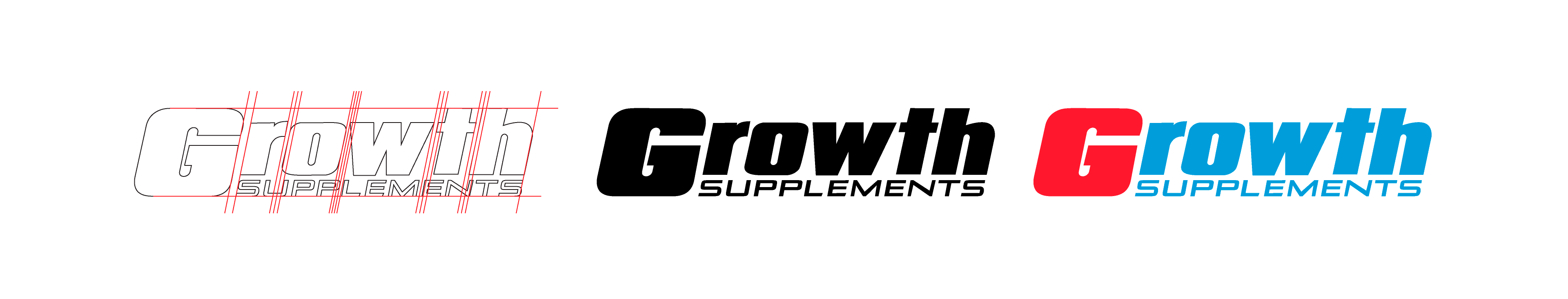
Ajustes no desenho
PT: Partindo primeiramente para pela forma do desenho, o primeiro ajuste foi o espaçamento da palavra “growth”, o espaçamento principal é do “G” com “r” para continuar com intenção de dar destaque para o “G”, esse espaço tem o valor X. Todos os outros espaços foram reajustados para X/2 com exceção do “o” com o ‘’w’’, que necessita de espaço menor (X/3).
Para tirar a sensação de deslocamento da tagline, foi feito um deslocamento do ‘’rowth’’ até a linha versal mantendo a altura de x. O espaço vazio que anteriormente ficava na parte superior central para a direita está na parte inferior onde foi encaixada a tagline seguindo a linha de base do “G”.
Com o resultado desses ajustes na forma, foi possível dar mais destaque para o “G”, uma leitura melhor para o logotipo, um equilibro melhor na composição na forma.
Partindo para as cores, reduzindo o número de cores para as duas que tinha mais destaque juntas, que seria a combinação do vermelho com o azul.
Adjustments to the drawing
EN: Starting with the design's shape, the first adjustment was the spacing of the word "growth." The main spacing is between the "G" and "r" to continue highlighting the "G," this space has a value of X. All other spaces were readjusted to X/2 except for the "o" and "w," which requires less space (X/3).
To eliminate the feeling of displacement in the tagline, the "rowth" was moved to the capital letter while maintaining the height of x. The empty space that was previously in the upper center to the right is now in the lower part where the tagline was inserted, following the baseline of the "G."
With the result of these adjustments to the shape, it was possible to give more prominence to the "G," a better readability for the logo, and a better balance in the composition of the shape.
Moving on to the colors, the number of colors was reduced to the two that stood out most together, which would be the combination of red and blue.
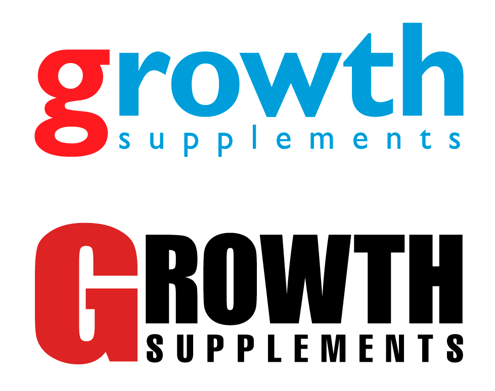
Buscando novas formas
PT: Ainda esteticamente não está agradável e ainda não remete a uma marca de alimentação esportiva. Fui em busca de outras famílias de fontes que fossem mais elegantes e pudessem remeter a alimentação, umas das tentativas foi o Gill Sans em caixa baixa, mantendo as cores originais. Porém, não remete a uma marca esportiva.
Como a marca tem presença exclusiva na internet, busquei uma fonte que tivesse algum tipo ligação com a internet, cheguei na Impact toda em caixa alta, alterei o azul para preto e o vermelho em um tom mais abaixo para casar-se melhor com o preto.
Para melhorar a composição busquei uma fonte tradicional que combinasse com Impact, cheguei na Helvetica Compressed também em caixa alta.
Looking for new ways
EN: It's still not aesthetically pleasing and doesn't yet evoke a sports nutrition brand. I searched for other font families that were more elegant and could suggest nutrition; one attempt was Gill Sans in lowercase, keeping the original colors. However, it still doesn't evoke a sports brand.
Since the brand has an exclusive online presence, I looked for a font that had some kind of connection to the internet, and I came across Impact, all in uppercase. I changed the blue to black and the red to a lighter shade to better match the black. To improve the overall composition, I looked for a traditional font that would complement Impact, and I came across Helvetica Compressed, also in uppercase.
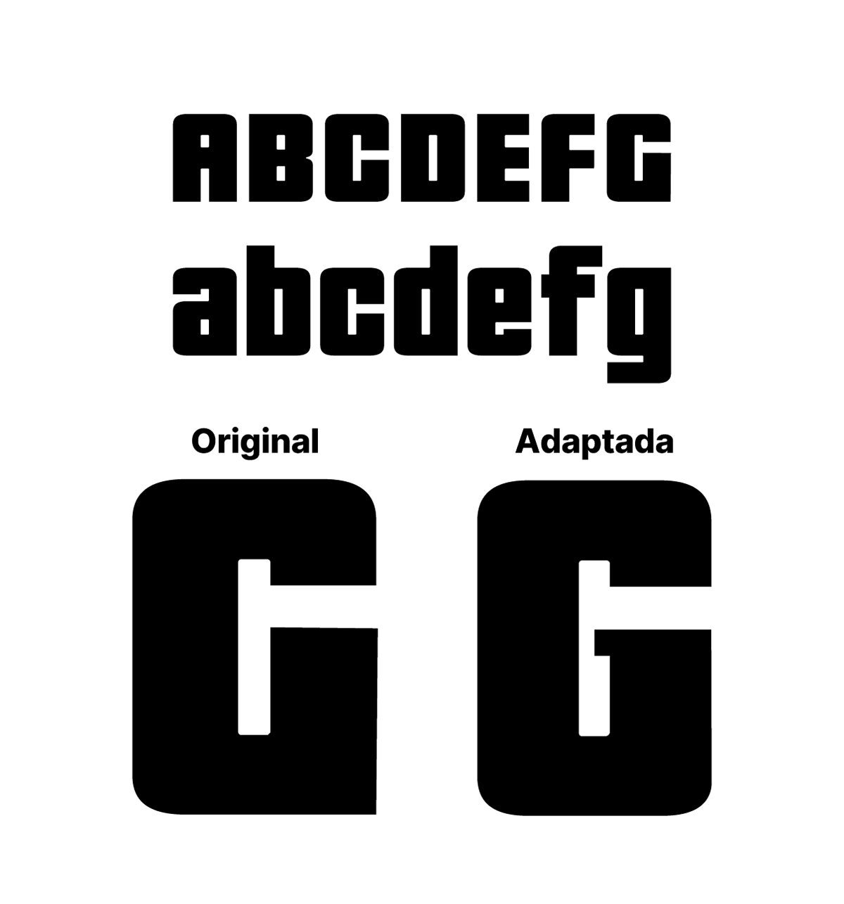
Símbolo
PT: Para fazer uma ligação entre as duas versões busquei a antiga fonte utilizada na marca que foi a Republica Minor, porém, ela não combina com a Impact, busquei algumas variantes da Impact consegui chegar na Porcine. Ela com consegue combinar com a Impact e a Helvetica Compressed juntas.
Peguei o ‘’G’’ em caixa alta da Porcine e adaptei o desenho da letra para ficar mais parecida com o ‘’G” da Republica Minor, com o ‘’G” adaptado, traz uma ligação com a marca anterior.
Symbol
EN: To create a connection between the two versions, I looked for the old font used in the brand, which was Republica Minor; however, it doesn't combine well with Impact. I searched for some variants of Impact and managed to find Porcine. It manages to combine well with Impact and Helvetica Compressed together.
I took the uppercase "G" from Porcine and adapted the letter design to more closely resemble the "G" from Republica Minor. The adapted "G" creates a connection to the previous brand.
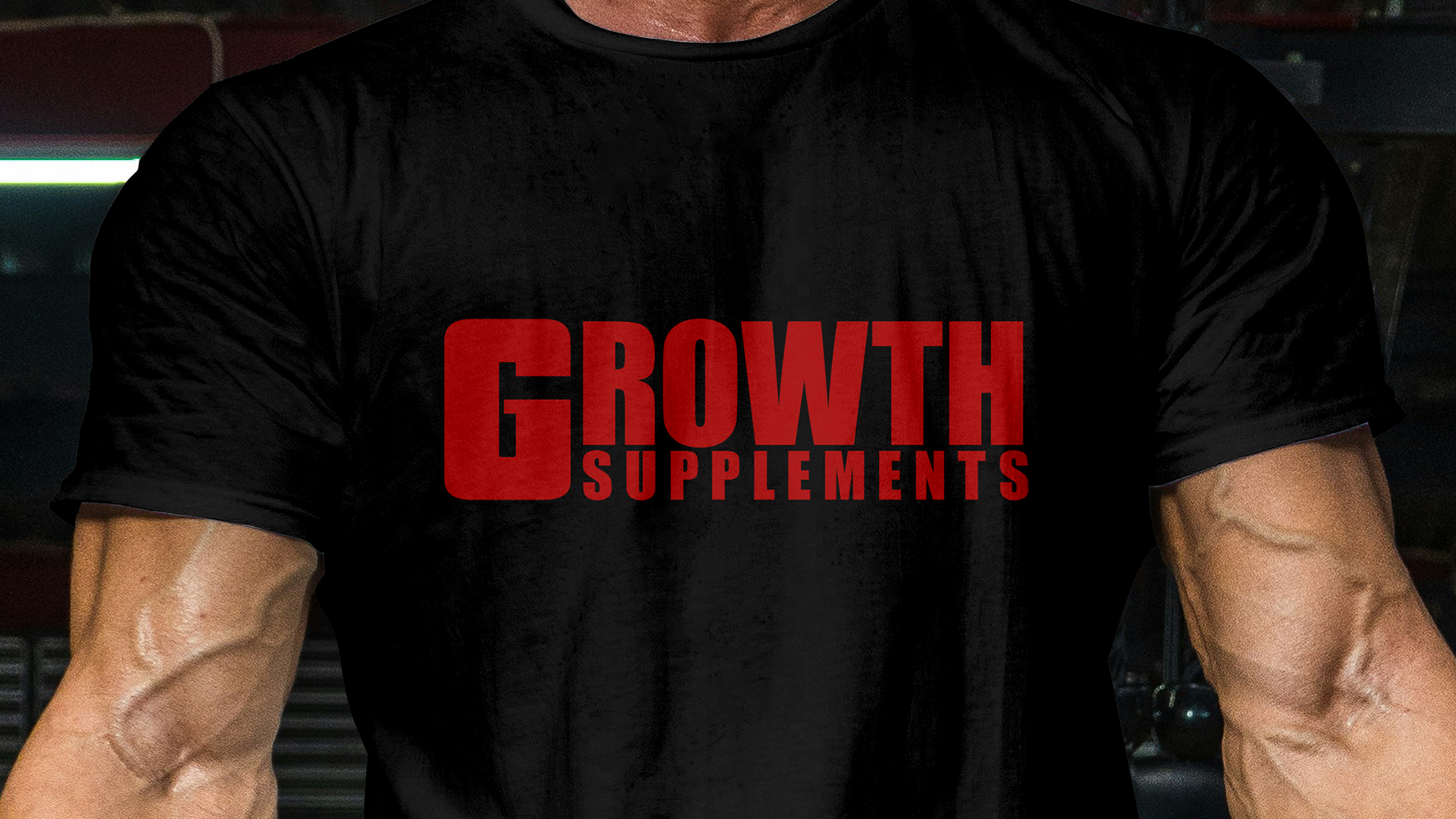
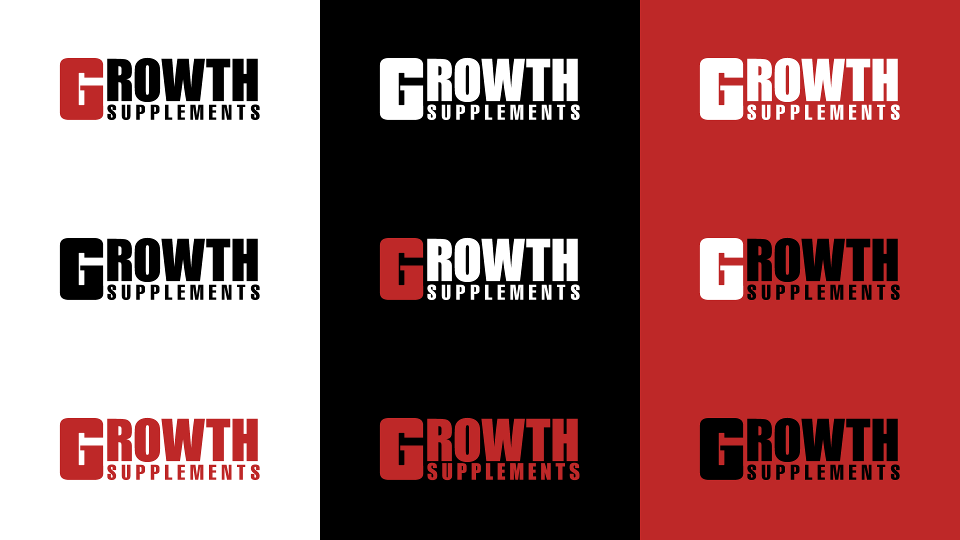
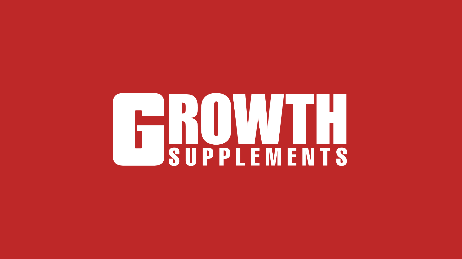
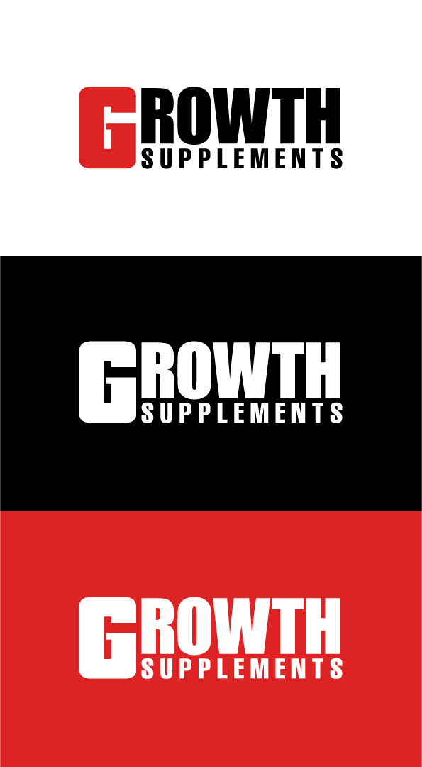
Resultado final
PT: O resultado ficou bem satisfatório, uma marca que parece mais ter uma ligação ao esporte. As cores se completam dando mais destaque para o “G” como era a intenção original. Todos os elementos têm seu lugar estabelecidos, e continuando mantendo a ideia de crescimento como o nome da marca sugere.
Mantendo somente o vermelho e preto, a marca fica um pouco mais flexível, em relação aos fundos, podendo ser usada em fundos escuros e claros ou até mesmo em fundos coloridos.
Final result
EN: The result was quite satisfactory, a brand that seems to have a stronger connection to sports. The colors complement each other, giving more prominence to the "G," as was the original intention. All the elements have their established place, and continue to maintain the idea of growth, as the brand name suggests.
By keeping only red and black, the brand becomes a little more flexible in terms of backgrounds, being usable on dark and light backgrounds or even colored backgrounds.
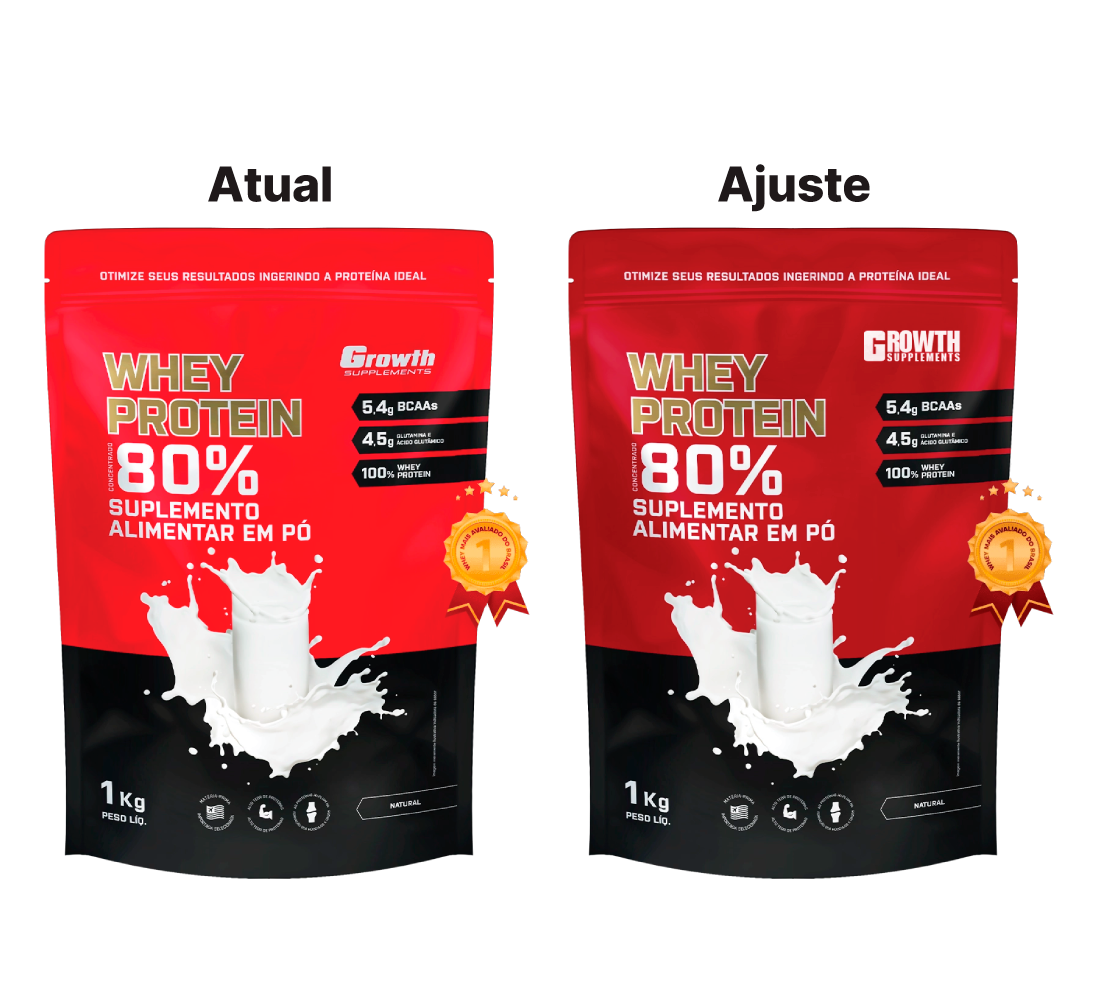
Aplicação
PT: Um ponto positivo que a nova marca é que ela se encaixa com a atual comunicação da marca.
Principalmente no principal produto da marca, o que seria preciso somente um ajuste no tom do vermelho da embalagem.
Application
EN: One positive aspect of the new brand is that it fits with the brand's current communication.
Especially with the brand's main product, which would only require an adjustment to the shade of red on the packaging.