PT: Trabalho acadêmico para o curso de Profissão: Designer Gráfico. A proposta do trabalho é criar embalagem para uma marca fictícia.
EN: Academic work for the Graphic Design course. The assignment is to create packaging for a fictional brand.
Briefing
Project: Mix de Chá com Sucos / Mix tea and juices
Branding : zen’in
Market: Bebidas / Beverage marketing
Shape: Lata / Can tea
Market: Bebidas / Beverage marketing
Shape: Lata / Can tea
PT: Pensar o visual da linha de chás zen'in: mix de chás com suco. As embalagens precisam ser modernas, jovens com ícones e representações visuais e menos texto, a ser aplicada em: Website (incluindo Perguntas Frequentes), Face, Insta, Banners, Folhetos, Flyers e todos os novos materiais;
Essa identidade deverá prever comunicação mais simples e objetiva = chá para ficar zen e curtir o dia. O público é jovem e gosta de uma bebida diferenciada com atitude. Zen’ in (japônes para todo mundo) tem uma fórmula moderna misturada com a tradição japonesa de preparo de chás.
Embalagem precisa ter um diferencial no PDV e ampliar a atratividade: exemplo, rótulos coloridos - a embalagem precisa ‘vender’ a proposta da marca na prateleira / no ponto de decisão; Material de Comunicação para suporte à Degustação em mercadinhos, Feiras Orgânicas sem contar que tem que funcionar no ambiente digital.
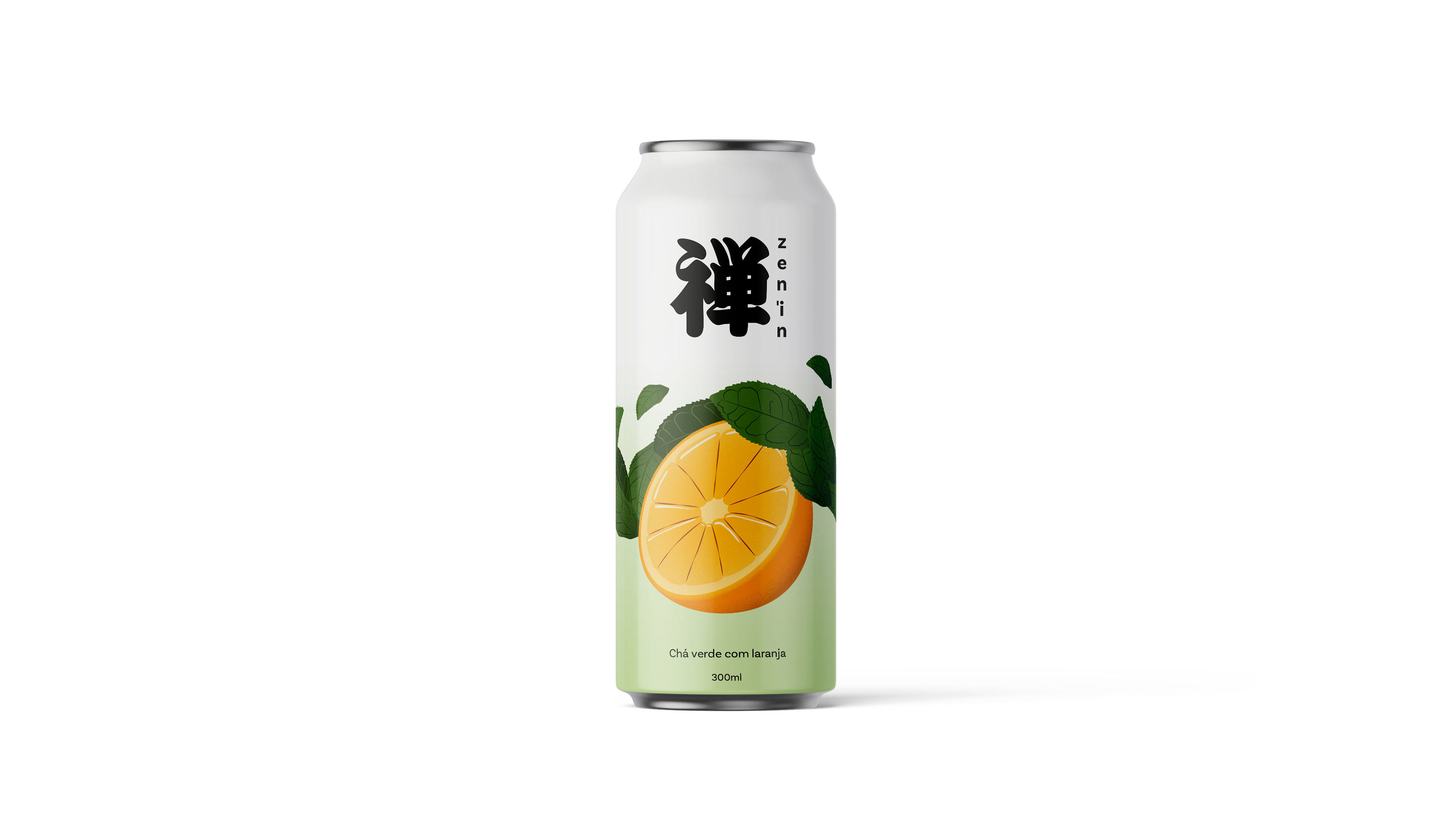
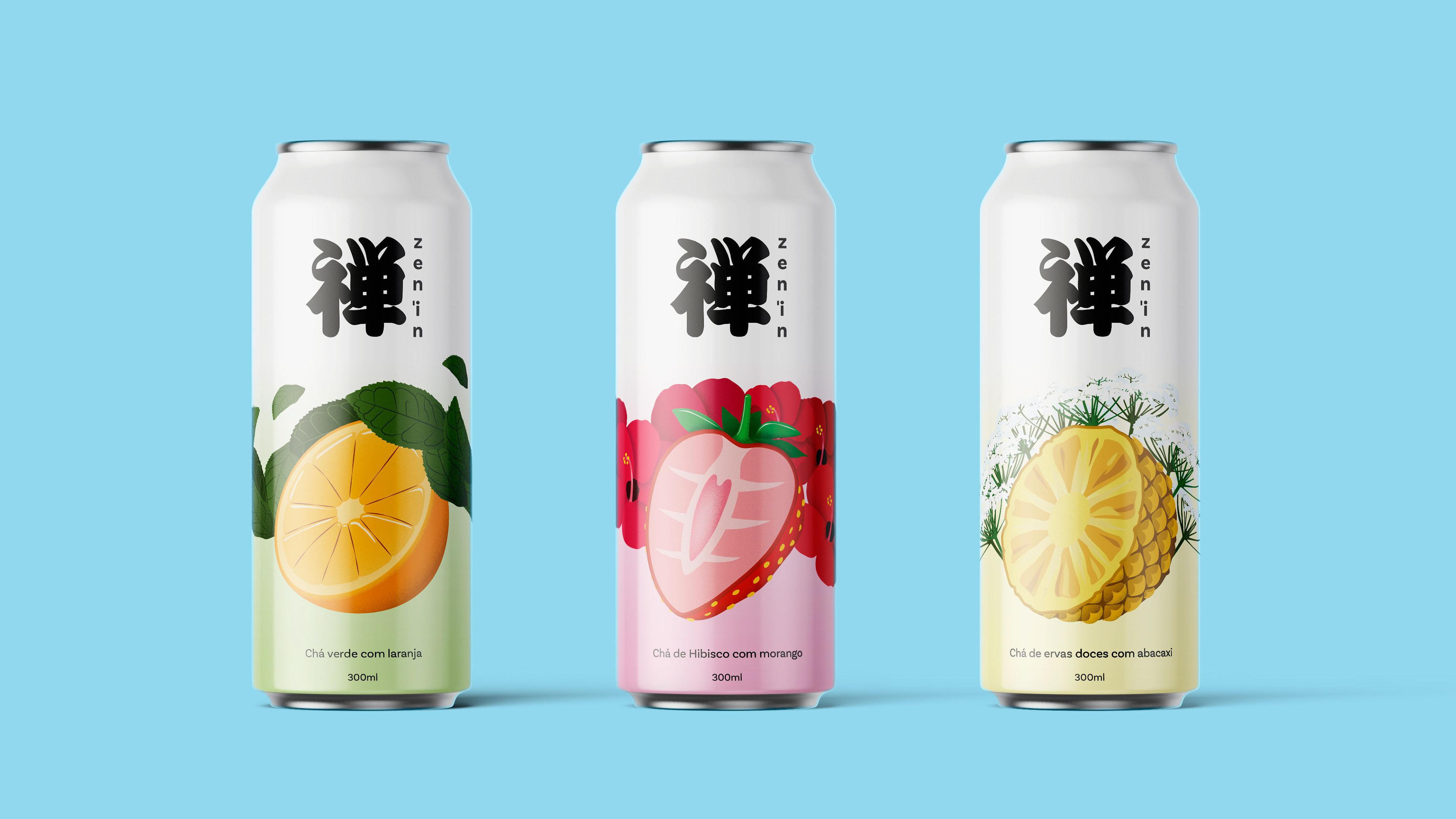
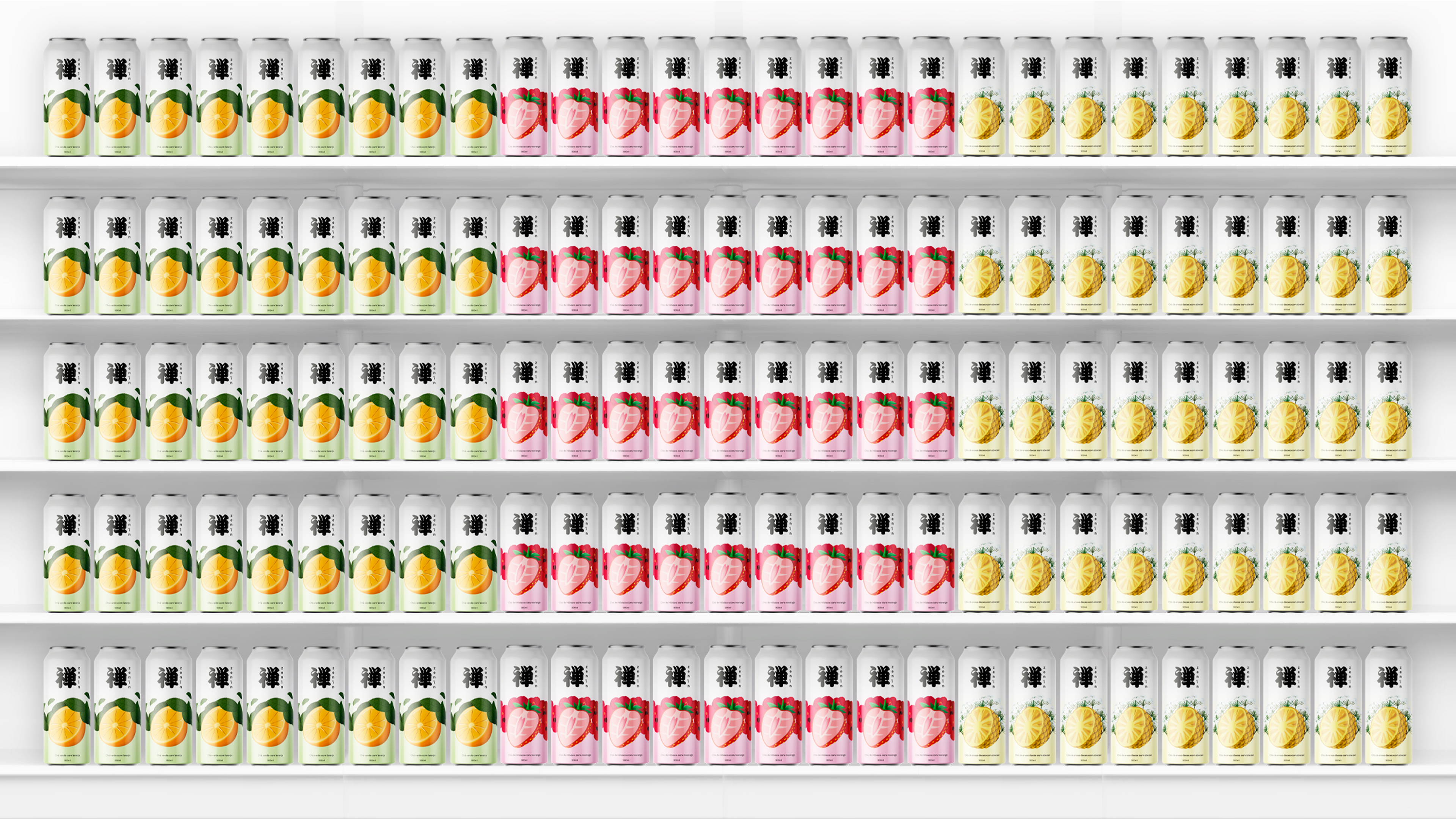
Por enquanto temos em produção os sabores suco de laranja com chá verde, hibisco com morango e abacaxi com erva doce. As latas serão de 300ml, concorrendo com Chá Pronto Tea 4U Danone e Feel Good.
EN: Designing the visual identity for the zen'in tea line: a mix of teas and juice. The packaging needs to be modern, youthful, with icons and visual representations and less text, to be applied to: Website (including FAQs), Facebook, Instagram, Banners, Brochures, Flyers, and all new materials.
This identity should provide simpler and more objective communication = tea to stay zen and enjoy the day. The target audience is young and likes a distinctive drink with attitude. Zen'in (Japanese for everyone) has a modern formula mixed with the Japanese tradition of tea preparation.
Packaging needs to have a unique selling point and increase attractiveness: for example, colorful labels – the packaging needs to 'sell' the brand's proposition on the shelf/at the point of decision; Communication material to support tastings in supermarkets, organic fairs, and also work in the digital environment.
Currently, we have the following flavors in production: orange juice with green tea, hibiscus with strawberry, and pineapple with fennel. The cans will be 300ml, competing with Danone Tea 4U Ready-to-Drink Tea and Feel Good.
Referência
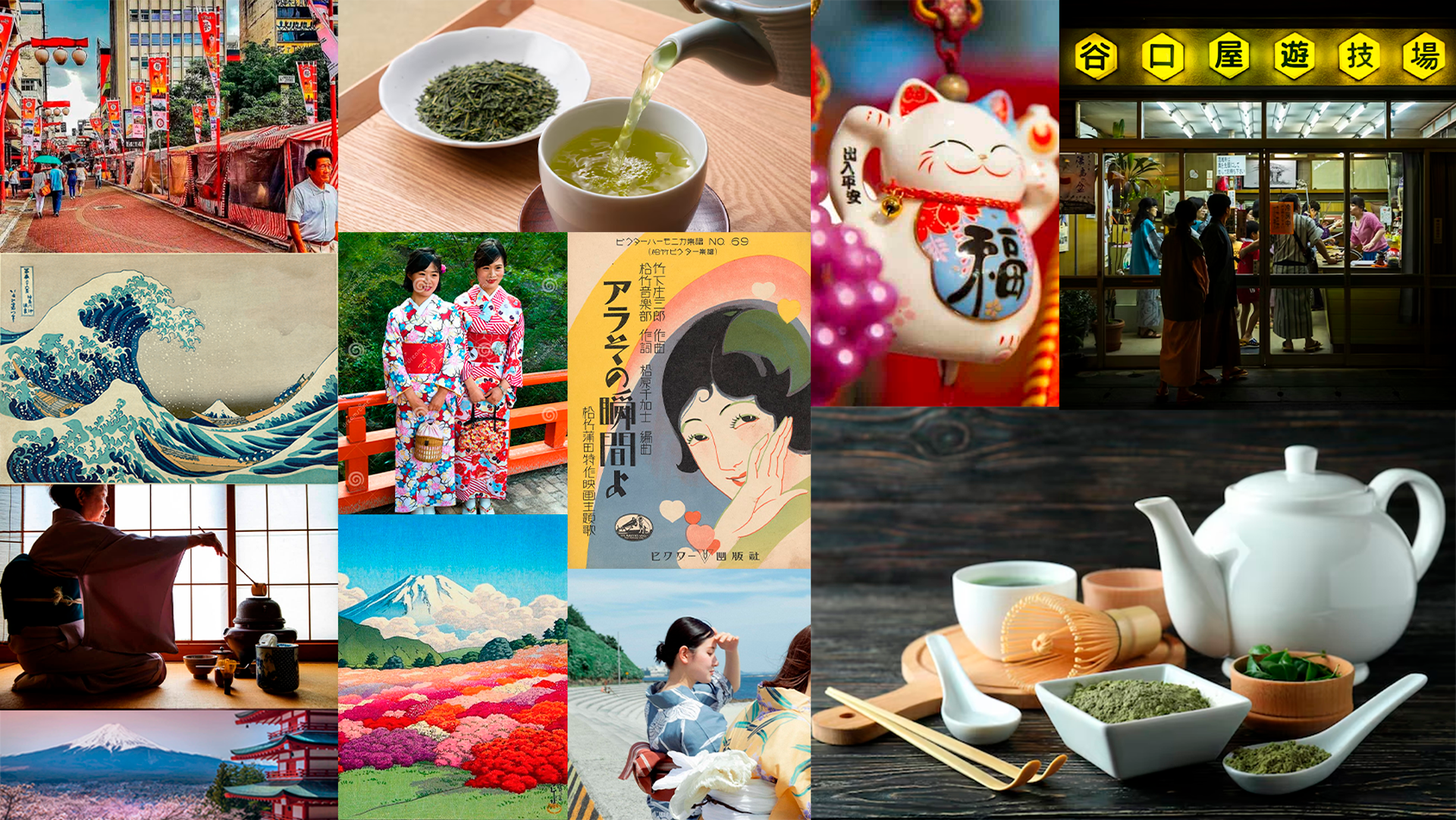
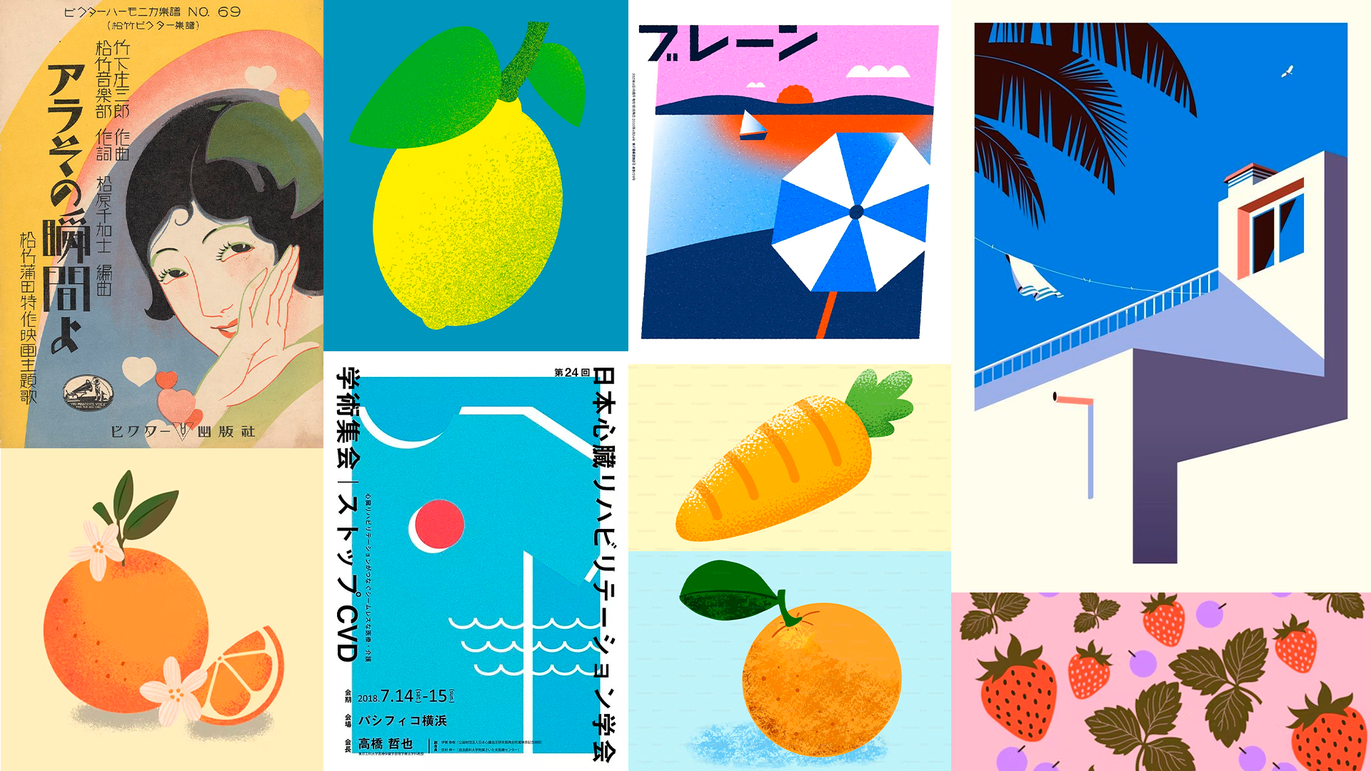
PT: A principal referência estética para a embalagem é a cultura japonesa tradicional, onde é bastante comum o consumo de chá como forma de socialização e prazer relaxante. Dando destaque para ilustrações coloridas e representações simples de símbolos do cotidiano.
EN: The main aesthetic reference for the packaging is traditional Japanese culture, where tea consumption is quite common as a form of socialization and relaxing pleasure. Emphasis is placed on colorful illustrations and simple representations of everyday symbols.
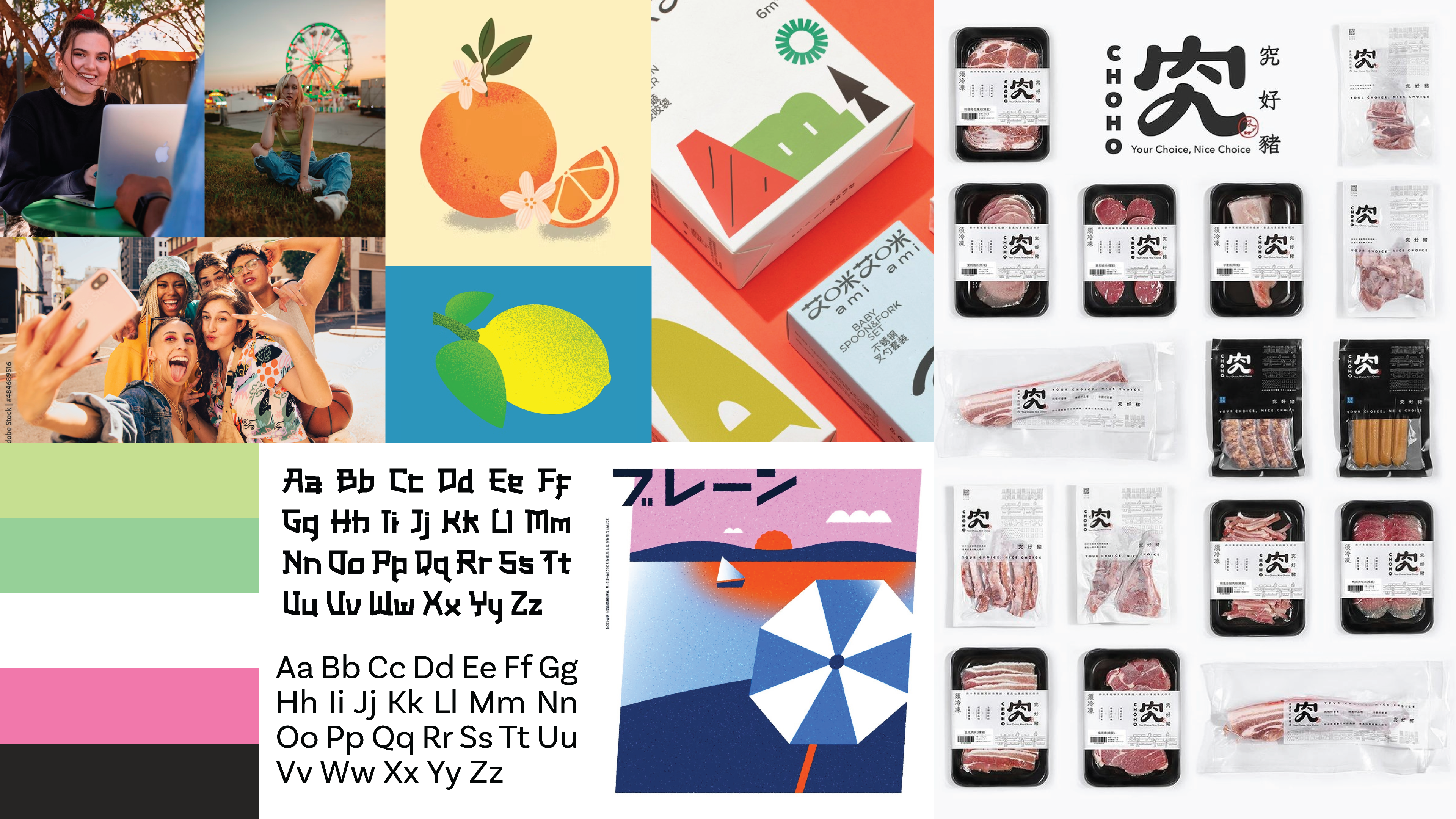
PT: Na fase exploratória, o objetivo foi traduzir a tradição japonesa para a linguagem visual contemporânea. Os rascunhos buscaram um design minimalista, priorizando a hierarquia visual entre os elementos, permitindo que a ilustração fosse a protagonista e comunicasse o sabor intuitivamente.
EN: In the exploratory phase, the goal was to translate Japanese tradition into contemporary visual language. The sketches aimed for a minimalist design, prioritizing the visual hierarchy between elements, allowing the illustration to be the protagonist and communicate the flavor intuitively.
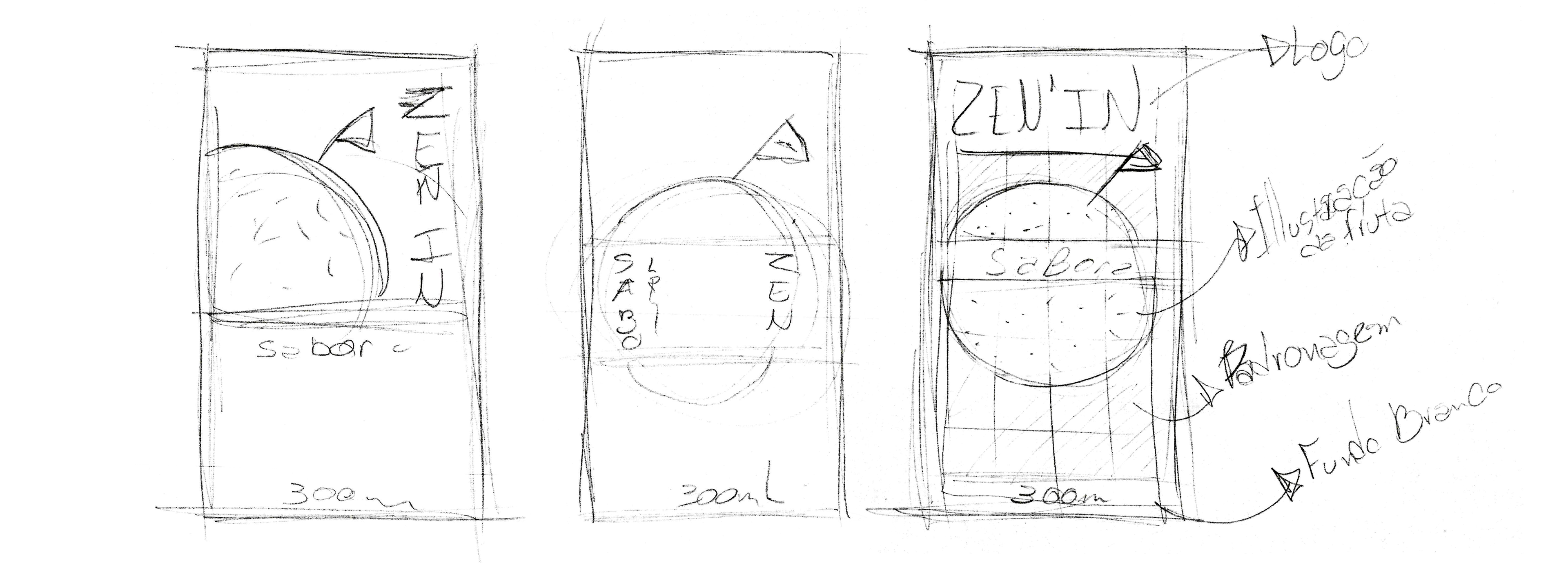
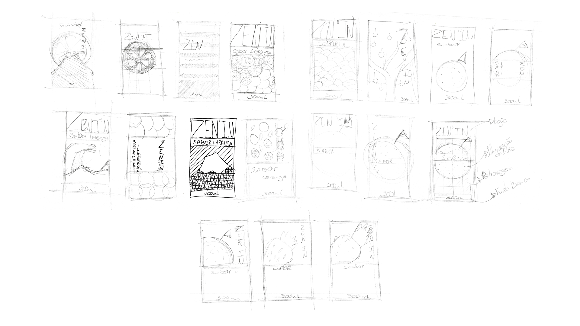
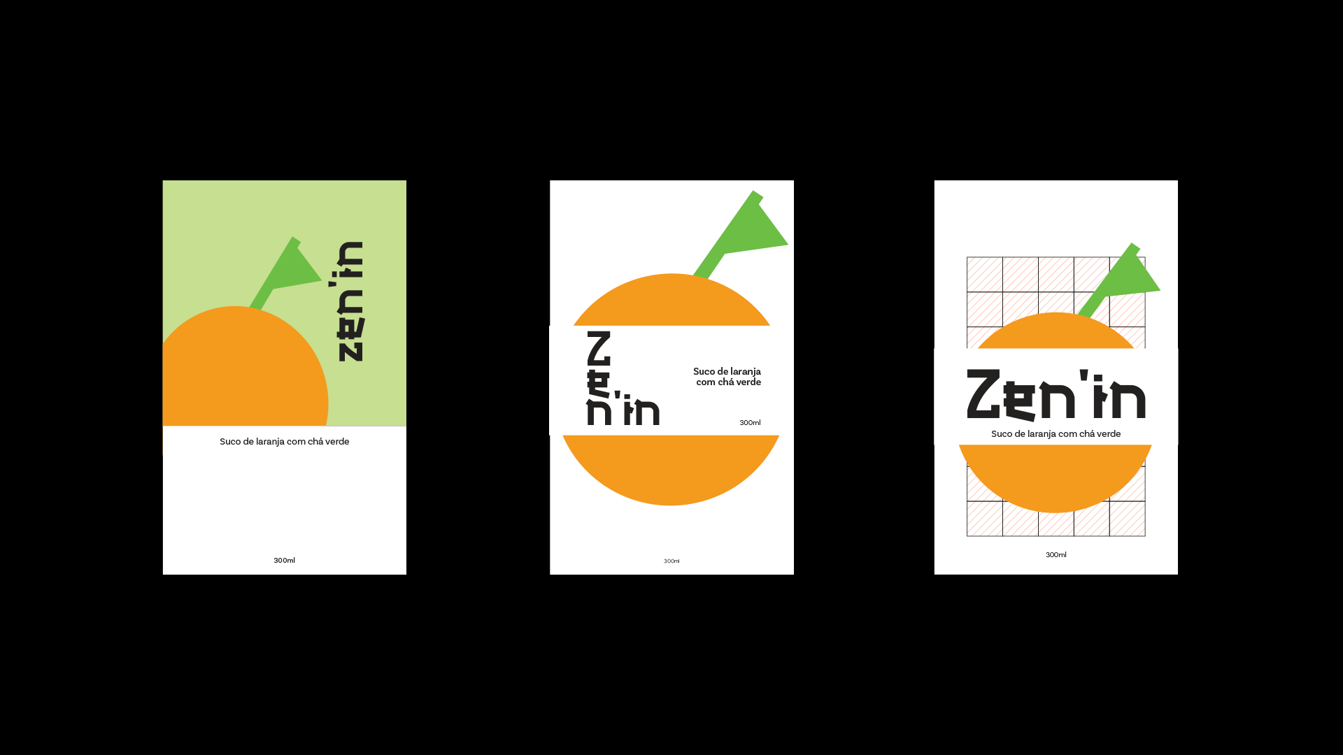
PT: Busquei construir as três ideias de forma simples, somente para conseguir visualizar de forma mais clara o potencial de cada ideia.
EN: I tried to construct the three ideas in a simple way, just to be able to visualize the potential of each idea more clearly.
Marca
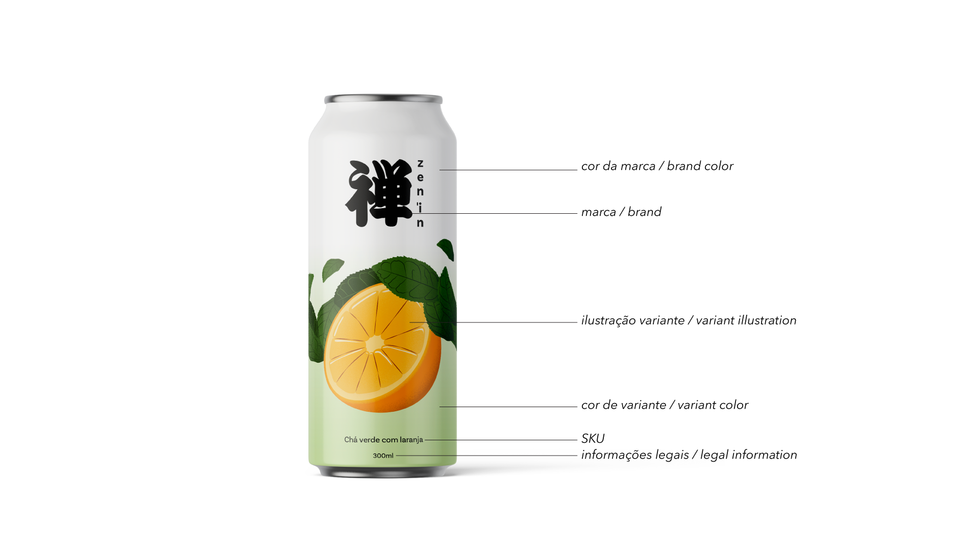
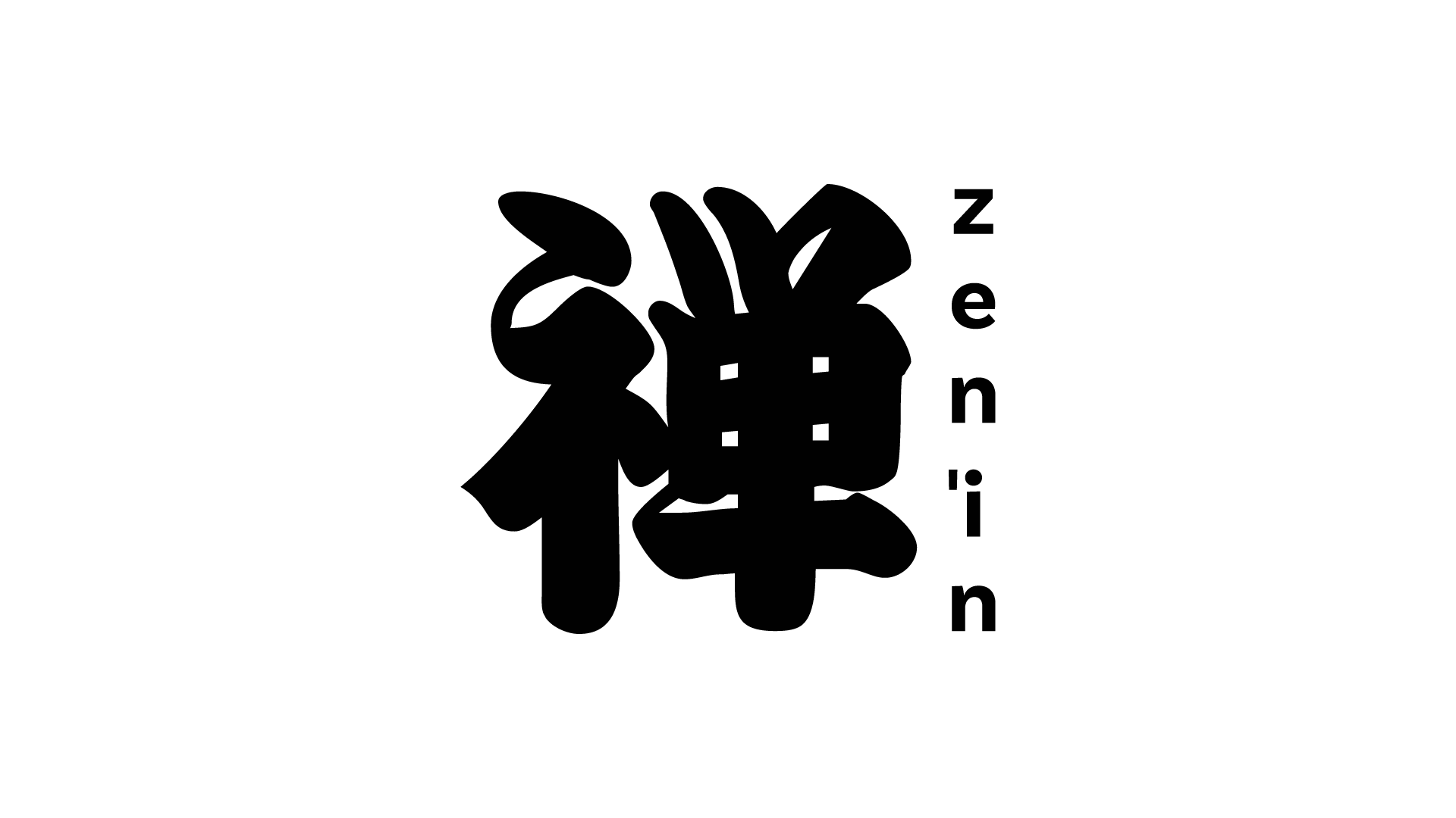
PT: Aproveitando a origem do nome, optei por usar o sistema de escrita kanji como símbolo principal, remetendo de modo rápido e visual à cultura japonesa. Para a marca, posicionei o logotipo ao lado do ideograma com a escrita de cima para baixo, resgatando a estética da escrita tradicional.
Branding
EN: Taking advantage of the name's origin, I chose to use the kanji writing system as the main symbol, quickly and visually referencing Japanese culture. For the branding, I positioned the logo next to the ideogram with the writing from top to bottom, recalling the aesthetics of traditional writing.
Ilustração
PT: Optei por uma ilustração flat para garantir leitura rápida e moderna. Apliquei texturas sutis nas formas, resgatando a sensação tátil e orgânica do papel e dos ingredientes naturais. É o equilíbrio perfeito entre o moderno com as formas simples e o tradicional com as texturas.
Illustration
EN: I opted for a flat illustration to ensure quick and modern reading. I applied subtle textures to the shapes, capturing the tactile and organic feel of paper and natural ingredients. It's the perfect balance between modernity with simple shapes and tradition with textures.
Resultado
PT: Misturando as três principais ideias dos rascunhos e aplicando todos os elementos estabelecidos, o resultado foi uma embalagem limpa e moderna, que ao mesmo tempo remete a cultura japonesa e que tem um design diferenciado dos concorrentes.
Result
EN: By blending the three main ideas from the drafts and applying all the established elements, the result was a clean and modern packaging that simultaneously evokes Japanese culture and has a design that sets it apart from competitors.